Sunday, 30 November 2014

Love Can Mend your Life, But Love Can Break your Heart


It means so much to so many people, Its not exclusive to any gender or sexual orientation, it is universal. You would not be reading this is if it did not exist, it provides peace, stability and happiness to millions everywhere and its not hard to see why.

I made these pieces for Leeds College of art as a test to get an interview and it seemed I passed with 2 colours and a white but I didn't like the uni anyway. But these have always struck a chord with me. working and positive and negative space, the simple and the conceptual. Even at that stage, I knew love was important hence the reason for choosing the heart. I had gone through my first break up by this point so I knew how it felt and what it meant so experience made these ring even more true.


Saturday, 29 November 2014

Carson, Not Even Once

At this stage in my graphic design career had never heard of David Carson, the master of grunge typography and the publisher of raygun magazine. I simply knew how to manipulate things in photoshop and thought what I can do with images I can sutrely do with type. So I did and these are the results. 

As I have developed an interest in type, I can see that they have carson written all of over them. He knew nothing about type when he made his pieces and at this stage (late college) neither did I so I once had something in common with a typographic genius. He broke the rule and and I may very well of done but how could I know I was breaking them without knowing of there existence.  This means that I can become one too. Maybe. Probably not. but maybe.


Friday, 28 November 2014

Water-Stain


 I am not a grudge but I am well and truly annoyed at the moment with the tutors of Grillust, because of one simple error I was marked as a 45 with no constructive criticism to move forward with. Thank you guys. Really Helpful.

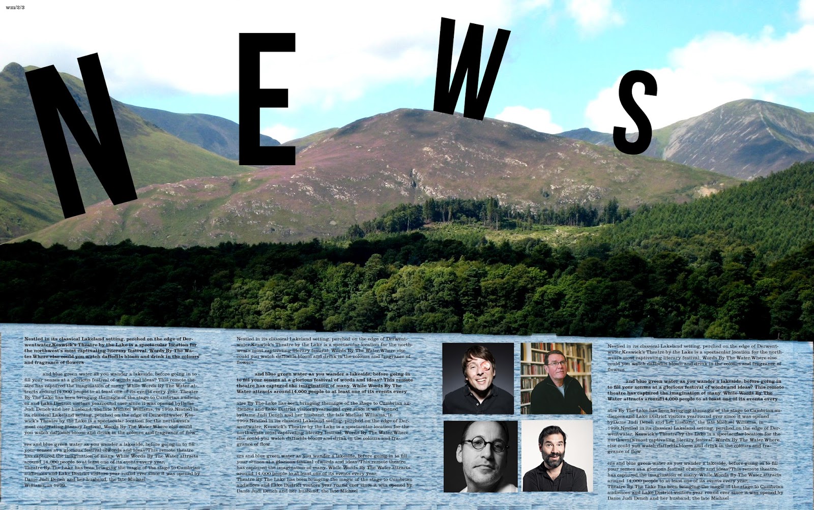
...Anyway, Watermark is a publication that is produced alongside the Keswick literary festival and our class has been given the opportunity to design this publication. There were many great designs on display during the sessions yesterday varying dramatically in terms of style, colour, approach, quality and ideas. Even with such an open brief, I never expected the level of creativity that was present. I ended up liking mine until it went to print and discovered that the type was too big so I have since fixed that. That is what can be seen here.

I managed to sneak an image of some of the cooler people from modern culture. Sue Perkins (cool Lady), Mark E Smith (Not a singer) as well as Adam and Joe (podcast kings).


It's Trippy

Looking through my laptop I discovered a photo of me that was taken for a film poster last year as part of my friends university project. I was very reminiscent of the pose struck by an actor on a Paula Scher Poster. So decided to add colours and make an interesting composition much like the poster that I've referenced. Not using type but using more of me. This is the only piece that uses so many multiple images of me that I can think of in recent times.

Thursday, 27 November 2014

8oh8 and 3oh3

 House music would never be the same gain without these beautiful machines but I beat you have never seen them like this before. Do the colours give you are clue? probs not. Anyway, these two pieces are the diagrams of the TB303 and TR808; the two machines that made house music what it was in the early days of the genre. Acid lines from the 303 and the distinctive percussion of the 808. This is my tribute to them. Its not bright, its not flashy and its not on pills like the scene. it is a quiet tribute and I hope that your found the promised land in these.

Wednesday, 26 November 2014

Magical Illustration Nation

Illustration is a thing that I am not very good at, never have been never will be. I like to draw but not illustrate. I have friends on the course that I am on, that can do this marvelously well. Magical Illustration Nation, Miss Sophie Taylor, can illustrate with great skill and I love her work This was her latest project as a one week comic. It's all about the love of the three C's; conventions, cosplay and (being) cool. 

Below are a few of my favourite panels from the comic. I went from not truly understanding the idea to loving the final result. Whats more is it was photocopied. King of the Photocopier approves. 


Tuesday, 25 November 2014

Read All About it, whatever it maybe.

 Satire causes endless amusement, Politics helps me make an eduacted opinion of people and places and Political satire got me the best grade that I have ever gotten. So to do a set of pieces inspired by political satire as well as humor made so much sense to me. Having previously been inspired by the cut out style of Jamie reid I thought first to attack news papers. The Press is the enemy as it makes so many people look bad but to cut them up and rearrange the words means I can make the people I hate personally seem like the enemy. I have tried to be controversial like my heroes Jamie Reid.

as a side note = Words can express so much but verbalizing things has always been hard for me. so to write them down is a much simpler and makes me feel less anxious about what I am going to portray.

Click the images below to see them full size.


Monday, 24 November 2014

Life Will Be the Death of Me

One of the most important songs in my life. the song that got me on the right path, out with the band pop music of yesteryear and in with the post punk revival speared headed by the Kaiser Chiefs, Killers, Bloc Party, Cribs, libertines and this band the Ordinary Boys. Not the biggest and by no means the best but this is my favourite tune. They are more well known for "boys will be boys".

Picking up a simple knowledge of typography from my tutors, I experimented with how things are read, I am using the past tense on this because it is quite an old piece of typography which I have only just found on my laptop. I tested it out on my mother. If you ever need to test typography, try your mother.

3/4, 3/4, 3/4, 3/4, 3/4, 3/4, 3/4, 3/4, 3/4, 3/4, 3/4, 3/4, 3/4, 3/4, 3/4, 3/4, 3/4, 3/4, 3/4, 3/4, 3/4, 3/4, 3/4

Scottish psychedelic indie rock band, sound great and indeed it is. So I asked the staff at the brickyard if I could so the poster and they were more than happy to let me. psychedelia requires a bit of warp and movement to it hence the image repetition. The bands logo, I actually think words really well for the band despite being an unusual typeface choice. The colours and the colours of the band them selves. Its almost very pro union, (if they did have an opinion in the referendum) but this also works for them. They sound a lot like temples and they are really big right now I have no idea why these guys aren't. This is one gig I will be attending. If indeed I can.

My Compliments to the Chef

I have beautifully unique and strange friends who express friendship in very peculiar ways. This was a "compliment " give to me today and I dare say I don't quite understand it's premise. I think it is because I have a very experimental approach to design and how I use the programs. It is not for me to explain what it is that I am to you. or do I? answers on a postcard please

Saturday, 22 November 2014

The Photocopier is my Screen

 The Photocopier is my screen. Andy is my hero so I combined the too. Having been crowned king of the photocopier by illustration station cos I am always photocopying things. I decided to experiment more with the potential of the copier. Using the one colour filter I made the above. it simply screens a colour cast over the image. The image of Andy was from the i Paper as it was a review of his exhibition in Liverpool, which I must must must go to.
Now Andy's probably most famous piece is Marilyn and these are Andy as the Marilyn's , at least my interpretation. Using a photopied image and a marker pen set. One is the colour version, when he was in the star light and the other, the black and white as his starlight starts to dwindle as well as his mortality, having died twice.

Friday, 14 November 2014

society has got it all wrong

I get really tired of ignorance when it comes to sexuality and gender. I am a hetrosexual man as far as I am concerned and I, in society, have it so easy. I don't have to worry about all of the rubbish that homosexuality brings. Tragic really in this modern age. But I believe that using the power of my art form I should promote an equality for all. I have done posters promoting love is love and to stop homophobia. These are on the same note. But not quite.

I am a big believer in, be who you are and as long as you are awesome you will be my friend. Society can't accept that. It wants to make everyone like robots; look the same and do the same things. which is saddening to say the least. Individuality makes people better. David Bowie wouldn't of made it if he was the same as every else and we all love him. (if you don't get off my blog). The point being you be who you are. If you aren't you will only hurt yourself.

Hope you like them, stay awesome, stay true to yourself


Thursday, 13 November 2014

Beauty comes in my shapes and sizes

That's my feet
That's my feet again

The 1960's were a time of innovation. in art, in fashion and in music. and to stumble upon an artifact of this time was a happy accident. Motif was an art magazine for the 1960's to preview art from that period. I chose Motif 10 over the others because Sir Peter Blake designed it. This man designed Sgt Pepper so this man is a legend. Below are a few spreads from the book that I found most appealing.
 It cost me £5 and it was worth every penny in my opinion. 


Monday, 10 November 2014

Birthdays on a student budget.


Celebrating someones birthday is always a difficult task on a student budget. but with the power of photoshop the task of making a card for the occasion could not be simpler (if you remember to make a card; sorry vin). all you need is a cheesy selfie of the person and a nice font. simples. So in order. Sophie's card, Laura's card and Lucy's Card. These people are my uni friends and I do this out of love not out of being evil.

It was my 20th last week and I got a card back by Laura; seen above looking angry. It's hit a new level of crazy.

Sunday, 9 November 2014

Baby, you're a Firewerk

That typo in the title is intentional, so don't worry, I hate that song so so won't credit it properly. Just the person I am.

Last weekend, fireworks lit up the sky's above Carlisle as part of the fireworks display. set to music the fireworks would explode out of time but at least did drown out the bad songs. No everyone takes photos of fireworks as if they are still things with no sense of movement or motion. So I spiced the light show photos up using long exposure, my fabled friend. Visual chaos is the optimum phrase here. Yes the photos repeat as well but this was done to light up the page, just like they did the sky. 

Saturday, 8 November 2014

a Long time in the making


This poster ws completed a month ago but has only officially hit the streets in the past weeks. It is the final poster for The Voyeurs show at the Brickyard. It took a long time due to the lack of band management. I made a much more effective previous poster but the band wanted to change the image so I had to start again. This poster has no imagination or beauty to it, it simply does the job and that's all that matters in the end.

Stand by more gig posters on the way...WATCH THIS SPACE.

Down in Train Station after 10?

I have only tried to upload these multiple times in the past 2 weeks since they were taken.

As per usual I pick my friends up from the train station every time that they go home. It's kind of a tradition cos more often than not I miss the bones off them when they leave. but anyway. on this ocassion the train was delayed so I had to fine something to do while waiting. twiddling my thumbs had no real appeal. So I got out my phone camera and discovered it had a long exposure option and these have always fascinated me, so I Passed the time looking an idiot and moving my camera around.

The result above do vary. The Heart shape is nice, the complete visual chaos and abstract seems to catch my eyes too. Hipsters do this all the time and claim it to be deep and thoughtful but I just like the look. More images in this style are to come...