Showing posts with label University. Show all posts

Friday, 4 March 2016

Depression Crushed me & I don't want it to Crush others

I am not one for pride, I have to go over and beyond to even be remotely proud of my work but this did. I have been working closely with Young Minds (the mental health charity) to produce a zine of people's experiences of Mental Illnesses along with some help if you do start to suffer at university (as many of you know; I have).

It launched yesterday via the Young Minds Website as a downloadable pdf which is available here. and here is my favourite part of this story; The guardian shared a link to it on an article about Mental Health; which can be read here. Me a liberal leftie (aren't these the same thing?) has had something he made shared on the Guardian website. I am sure there will be bigger achievements ahead but this  and
  • Having my name in NME before it came rubbish.
  • Performing a song I have written at an O2 academy (2).
  • Having Courtney Barnett reply to an email I sent her.
  • Completing Resident Evil 4, Devil May Cry & Ratchet and Clank.
 I am doing well. Below I have embedded the zine for your viewing pleasure. Read it! Promote it! Share it! Print it! Just spread the word about mental health.

I did my bit yesterday morning. I needed to speak for two minutes in front of my class about me so I spoke about my Mental Health. I hate speaking in front of people but it went well. It did get a little preachy but It's just who I am it has shaped what I am, what's the point in not mentioning it. Depression crushed me and now i don't want it to crush others. It got a massive round of applause with various well done comments and even a peck on cheek. Thank you class if you listening, Thank you YoungMinds and who ever is reading this.

Friday, 28 November 2014

Water-Stain


 I am not a grudge but I am well and truly annoyed at the moment with the tutors of Grillust, because of one simple error I was marked as a 45 with no constructive criticism to move forward with. Thank you guys. Really Helpful.

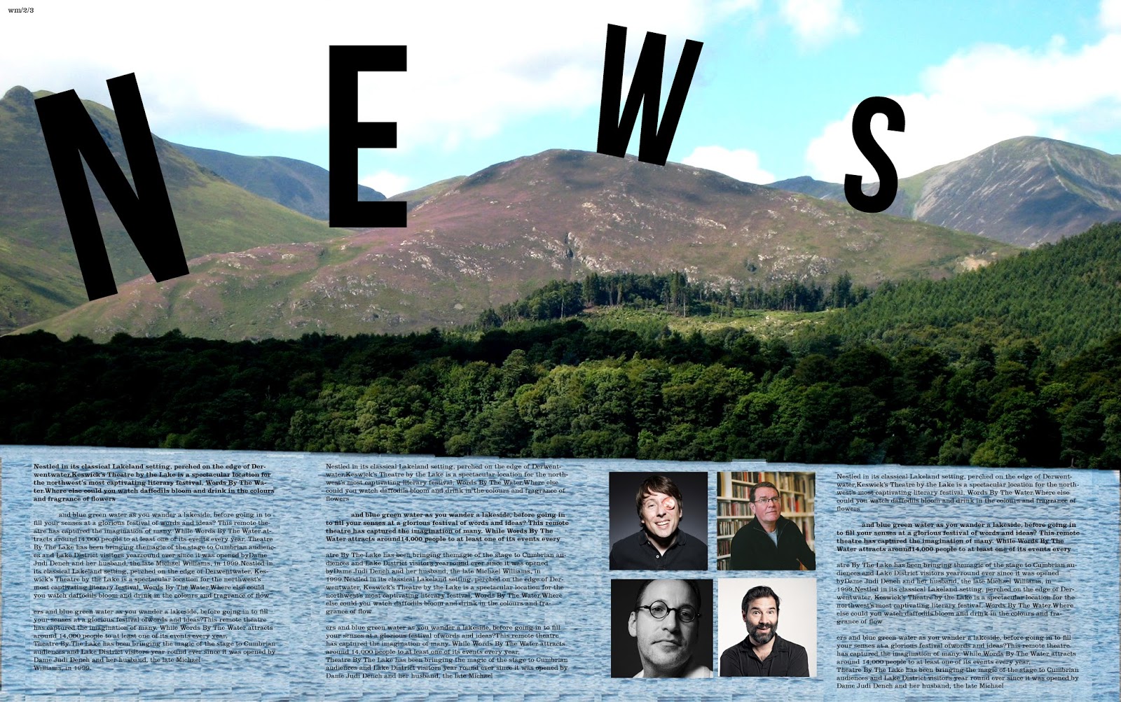
...Anyway, Watermark is a publication that is produced alongside the Keswick literary festival and our class has been given the opportunity to design this publication. There were many great designs on display during the sessions yesterday varying dramatically in terms of style, colour, approach, quality and ideas. Even with such an open brief, I never expected the level of creativity that was present. I ended up liking mine until it went to print and discovered that the type was too big so I have since fixed that. That is what can be seen here.

I managed to sneak an image of some of the cooler people from modern culture. Sue Perkins (cool Lady), Mark E Smith (Not a singer) as well as Adam and Joe (podcast kings).


Wednesday, 24 September 2014

the Bad, the Font and the change of opinion

 Bauhaus 93, I hate you. You are considered a cool and very fun and original font. I have seen you used on clubs and bars and posters. The general public uses you all the time but you have no redeeming features. You look nothing like any that was ever used by the Bauhaus school. the school that is one of the most important designs schools on the planet. ever. The Nazi's didn't like them but I do.


So I decided to take a stand and try and improve the reputation of the font as a mission. By making these typographic illustrations. The redeeming features of the font is that it bold and strong shapes to it thus making it easy to create images using the letter forms. This self initiated project is reminiscent of a type project that I did at uni and for the first week I did the project completely wrong. I was simply meant to make a pattern out of type and not an image.


Monday, 8 September 2014

State of the Nation

Satire is one of the things that I do enjoy a lot. so instead of doing some music related design, I did a piece of design based on this concept. These posters are based on the idea of a dystopian state run
future, very similar to the world that George Orwell imagined in 1984 and David bowie used as the concept for Diamond Dogs. The original design style harks back to the 1930's style of newspaper ads. I chose this style because it is the one that is used in Fallout; the video game about a nuclear future.


Sunday, 7 September 2014

A Present Suprise


Presents come in all shapes and sizes. Some are thin, some are small, some are big, some are 3D. These presents are from my illustrator friend, Sophie. It illustrates the miss adventures that we got up to last year at uni making forts and sticking things...onto...my face. Simply done on a blue post it note with a marker pen, Fine Liner and Typex. I think that these are great and received the great news that more are to be done.


Monday, 14 July 2014

Not a Type-ical day

I have a bit of practical design experimentation during the course of the last week. It was based on the use of ink and typex. I had previously discovered that if you first write in typex then place ink on the top of it. it does not seep through onto the other side so you end up with a reverse letter form on the other side. So using this I tried this again but chose to do the whole alphabet to see how it looked. It was going to be a "grunge" typeface; not one that you would commercially use for a heading but for a one off piece. Once the process work had been done it looked like what you see below. So after that I drafted it into photoshop and made the negative space letter forms into positive space ones. which is what is next to the process work.

Once they were done, I did some one off works in this style to see what they would look like so these. I chose words that would be relevant to the style of the the font so "wet" and "Dirt" were chosen. These appear to be more successful due to them being bolder in weight and easier to read. I do like these and think the process was worth it to find out this out. 

Shape of Design

 
Over the weekend, I spent a lot of my time on Photoshop experimenting with patterns and different typefaces to see what interesting combinations I could come up with.   I have become a very big fan of Bebas, the typeface used in the first piece "The Candy Shop", only problem is it only has one weight. I have always wanted to use Gill Shadow but never had the chance so I have used this in the second piece "Good Mood". Shape tools have interested me too. I have utilized the line tool differently making it so the line is staggered and not just straight. This has been used throughout the pieces too.


Saturday, 7 June 2014

Speaking With Typography


 The Talking Heads are a great band. A fusion of Punk, World and funk music doesn't happen everyday. there movie Stop Making Sense is a flawless masterpiece showing the band the the peak of their creativity and musical diversity. All of them were art students and they all took calls from the arts for the music as well as the packaging. Bearing this in mind I made these posters influenced by 4 very different art styles as well as different designs that they have made.


Friday, 6 June 2014

A Present of Typography


The Wedding Present are just one of those great British bands whose refuse to quit. They have been active for many years and they still have the capacity to fill a decent size venue. They are independent of any of the big record companies which is evidence that you don't need them to survive. For all of these reasons they have had a big impact on me (that and they played a flawless gig in front of my very eyes).

To return the favour, I made these typography posters to demonstrate some of David Gedge's best lyrics. Each Poster features Lyrics from the best song on the album (in my opinion) and in one form or another a version of the album sleeve. These were self initiated designs but have sent them to the band but no feedback has been given.

Thursday, 5 June 2014

Highlights; Trying Something New


 Trying something new is always a good way to develop as a designer but doing so isn't always that easy. In uni, an entire unit was dedicated to doing exactly that. We were given two different designers or artists and we had to do pieces in the style of said person. Above you can see my work inspired by the great design guru; Chip Kidd, who is probably most well know for his logo for Jurassic Park. His main selection of work is in the design of high quality book jacket design. All of the above are mocked up potential book covers in the vain of what he would design.

Below, are selection of four different paintings/drawings that I did during the other part of this unit. I have not done any painting in many many years as secondary school kicked it out of me because they taught me nothing. These didn't turn out half as bad as I thought considering this fact. These pieces are in the style of Joan Eardley, a Scottish born artists who's main focus was landscapes and images of the poor youth.


Saturday, 31 May 2014

Highlights; Logo's

 As a designer it is wrong to have favourite projects but when a logo brief comes a long I really like it. It is always a challenge to try and fit an entire company's style and ethos into a single identity and for said identity to be seen everywhere.

This project at uni was creating several logos for stupid and silly companies that could never exist. I worked in collaboration with my friends Vincent, Sophie and an exchange student called 吴吴珊. We were set the challenge to make 9 logos (because our group was so big). We collectively got a decent grade out of all of our hard work. 

The approach for each of the logos was different and the style of each one had to be different for each. Working in collaboration made it easy to decide on which way to do each one was best.
Portable Double Bass
Faberge Scotch Egg

Night Club For Pensioners
Fighting Game for the Under Fives

Jamaican Cheese
Recycled Cardboard Robot
Tree Based Refreshment Drink
Turbo Charged Scooter from the Elderly

Lost Sock Detector

Wednesday, 21 May 2014

highlights part 2: Typography


Typography is something that I have never explored before coming to uni. I had no prior knowledge of it what so ever apart from font choice was important. I wasn't told which ones were good but knew that comic sans was bad. I have since been taught that;
  • Garamond
  • Didot
  • Baskerville
  • Times
  • Futura
  • Helvetica
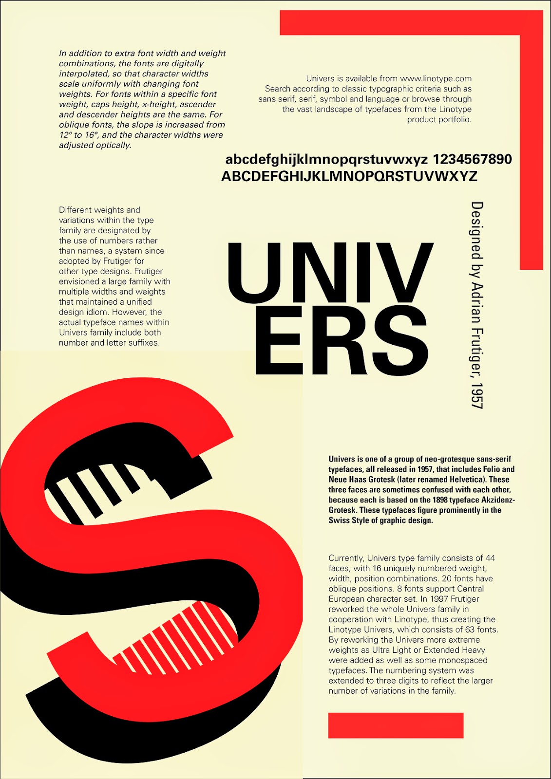
  • Univers
  • Gill 
are all top notch quality fonts. I will never forget this. The amount of bad typefaces outways the good by 95% to 5%. Type is something I have explored more and more throughout the year. Above are the pieces from the 2nd type project of the year. They are poor examples of good type but I count them as a milestone.My typography improved and below is the my best marked piece of type that was featured on the course blog. It was called premier league typography.