Friday, 28 November 2014
Water-Stain
I am not a grudge but I am well and truly annoyed at the moment with the tutors of Grillust, because of one simple error I was marked as a 45 with no constructive criticism to move forward with. Thank you guys. Really Helpful.
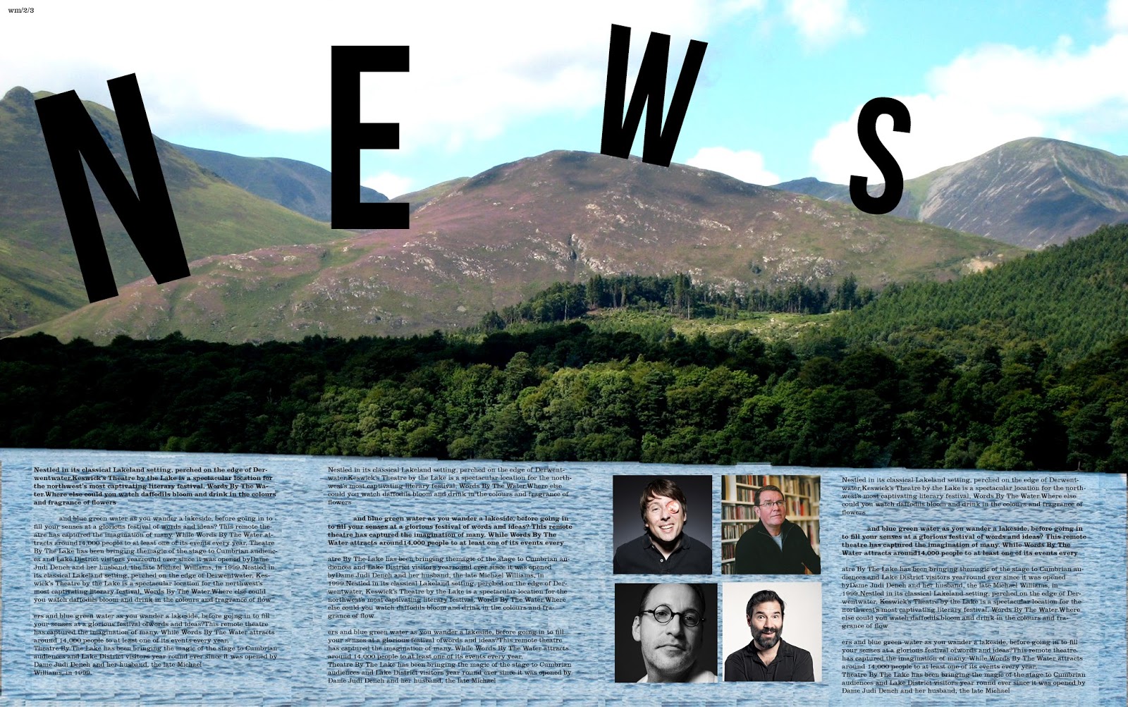
...Anyway, Watermark is a publication that is produced alongside the Keswick literary festival and our class has been given the opportunity to design this publication. There were many great designs on display during the sessions yesterday varying dramatically in terms of style, colour, approach, quality and ideas. Even with such an open brief, I never expected the level of creativity that was present. I ended up liking mine until it went to print and discovered that the type was too big so I have since fixed that. That is what can be seen here.
I managed to sneak an image of some of the cooler people from modern culture. Sue Perkins (cool Lady), Mark E Smith (Not a singer) as well as Adam and Joe (podcast kings).
Labels:
2014,
design,
experimental,
Graphic Design,
Grillust,
Kerning,
Photoshop,
Publishing,
simple,
Something New,
type,
Typography,
University,
Watermark
Subscribe to:
Post Comments (Atom)


No comments:
Post a Comment