Showing posts with label Typography. Show all posts

Friday, 31 March 2017

Ps it's a good song.

I am a man who is not hard to please. (Beer and Pizza) I am not high maintenance when it comes to my work. I just expect a project to have a start middle and an end. (this has nigh on happened every time). Very much like my favourite fiction books Captain Underpants or one of my favourite films 24 Hour Party People. Yes, design is a story, a process if you will, but when project doesn't end, I get cross, especially when it is finished my someone else.

My boss manages a band, Lisbon. Lisbon have a new song, Jamesy gets the offer to design the sleeve. A dream come true. (it's gonna be great, it's gonna be the new unknown pleasures)


So James scurries home to look at pinterest and  consult the great books and comes up with four ideas. (Well I had more but four good ones) None of which relate to the bands old style.

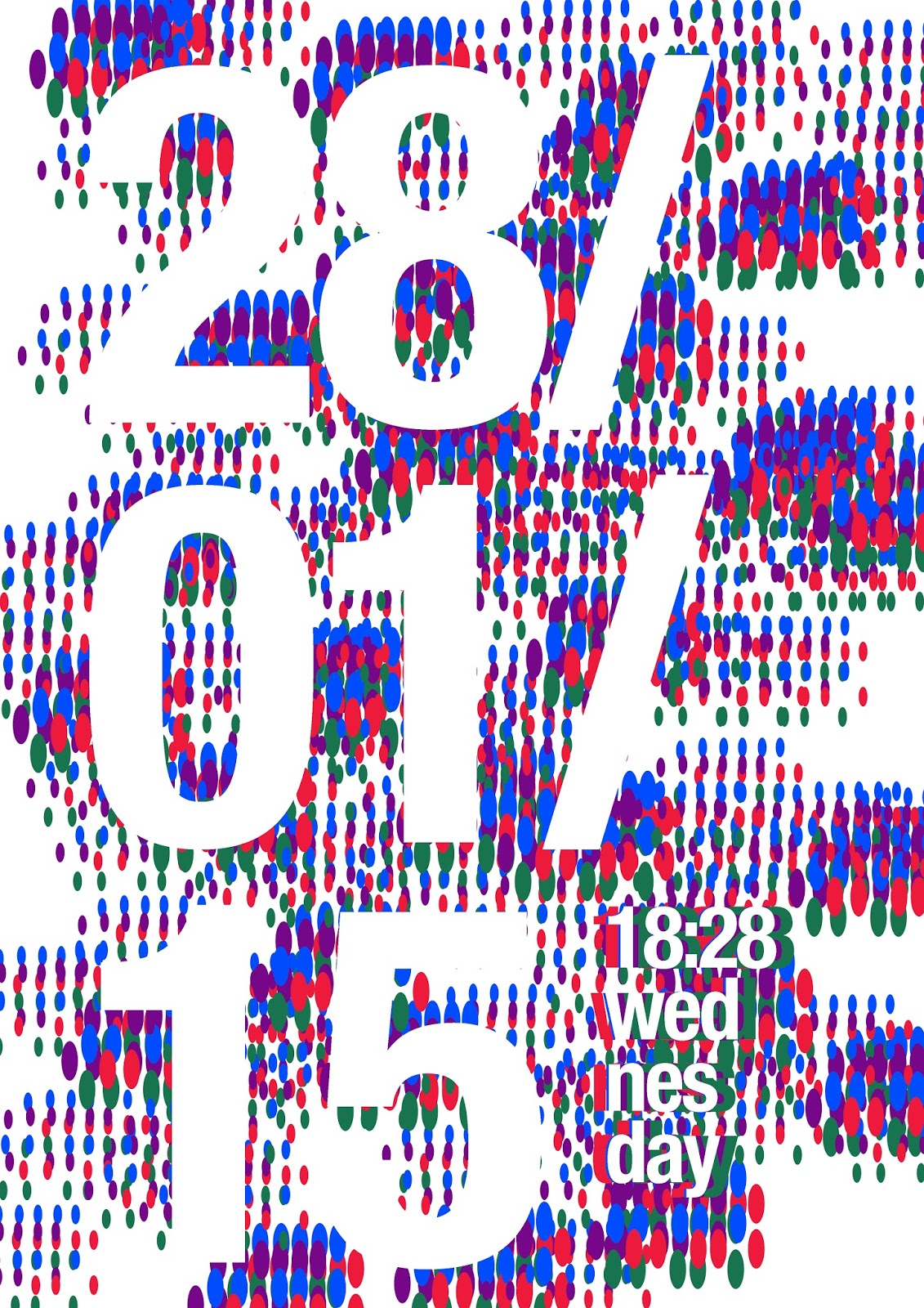
So what we have here is some vector shapes, an bizarre dotted typeface mirrored on top of each other, a cropped photo of a Keep clear gate in Carlisle (from the James Reay photo archive™) and some trendy typography.

These were sent away for customer feedback. Nothing.

Three days before deadline okay here is a photo we want to use. A nice abstract holiday snap. Wonderful. However small type didn't work on it. Big type looked good but not perfect but I needed something so sent these off.


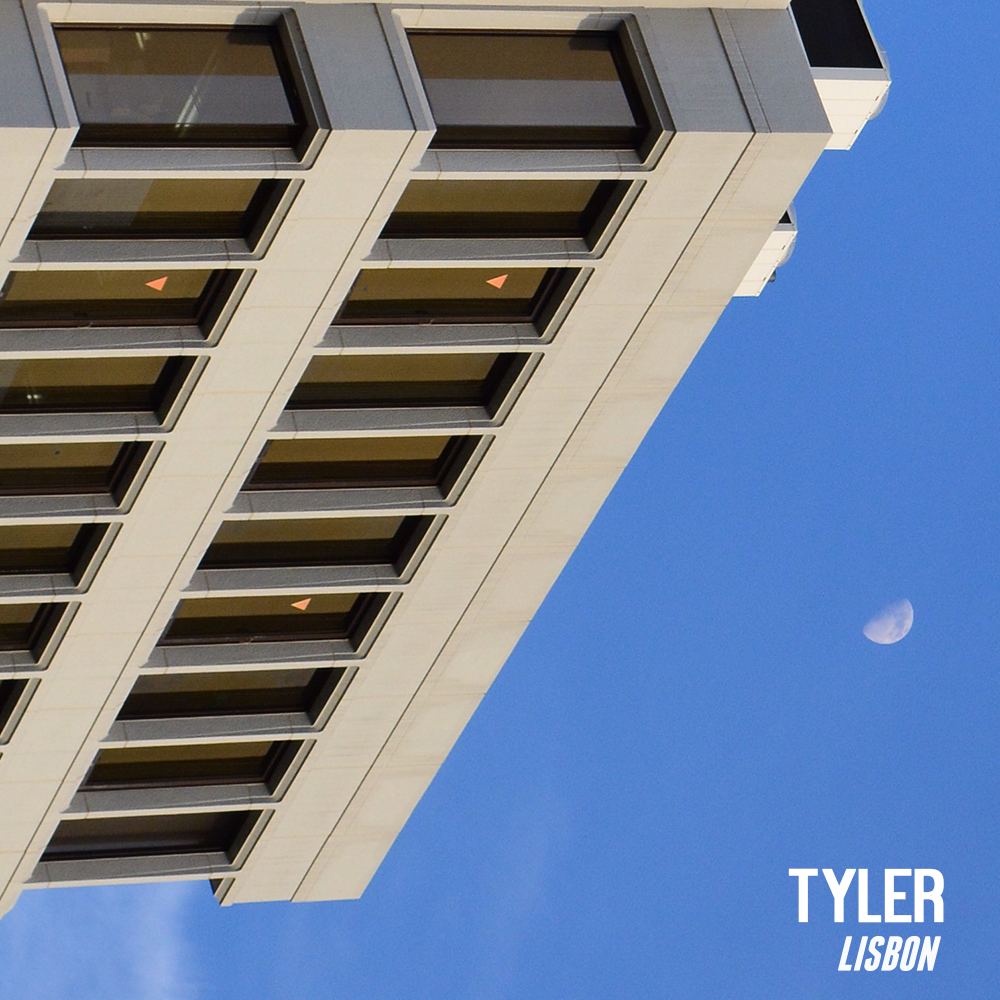
A few hours later, I had another go. This time instead of full bleed image what about framed image and it was a good call because text on the white looked so much cooler and with the addition of an extended typeface it looked fab.


Sent this off to a multitude of replies.


With some type layout changes. Cool. Oh and colour changes. No problem. And go back to that original full colour image. oh no. And add a 3D effect. That could be interesting.


I hear nothing and then see the artwork I don't like that much being used but at least it's mine.


A day later they are using there own image with a good font used inappropriately and the image has had its hue in a skew. (That artwork will not be reproduced here due to spite.)

Ps it's a good song.

Friday, 16 September 2016

Advice No One Asked For...

What did you learn at uni? Well...

A few months ago I looked at all of my uni notebooks and found so much good advice, that I had forgotten about or just not take and thought it would be good to share these. But Scanning in my scribble and making people log onto my blog to read them sounded redundant so I wanted to make them pretty and here we are.

I have been trying this projects for a few months but couldn't get it right so I made this a one day  challenge to get it done. I have succeeded. I initially tried to make it like the work of Kate Moross and it looked just like I was ripping her off (that's not what I like to do). So a shift around was needed. I tried again by taking her as a inspiration stylistically, not as a source to be plundered.

Here we are using hand type (digitally); using the pen tool and simple bright colours. I used my handwriting quirk of using both upper and lower case at the same height as I did with the INVRTD typeface. I think they almost look kitsch in someway.

Wednesday, 14 September 2016

Back to Basics / kcaB ot scisaB

Back to Basics were a popular beat group from the North East of England from 2010. Featuring the talented guitar player; Phillip Reay and the designer/drummer James Reay. The latter has recently started a campaign to redesign and repackage the Back to Basics trio of albums and the live album. 

I am the latter band member and below are my simple typographic interpretations of some of the Back to Basics 'hits' and a simple dabble of colour. Looking back the album covers and singles were suitable at the time but a facelift can sometimes be seen to be a good thing.


Friday, 5 February 2016

Needs More T-Rexs

Graphic Design and illustration. The course I have been on for the past nearly three years and it's all coming to an end soon. To summarise this three year time, we have to, as part of the course, have to put on an exhibition. An exhibition of our work, including mine. So we need to start organising it now. We have started the funding but need to start the branding.

Below is my first attempt; it's a very Barney Bubbles style tribute (with me studying him on my dissertation). None of the letters on here are any sort of font they are just vector shapes. The colours just needed to be as maddening of an experience as possible because who doesn't love colour, right?

The reason I am showing you this at this stage as very few in the class actually liked it. Specifically 6 people. So it's not going to be used no matter what. Nice idea though. Also the name is changing from patchwork to I don't know. Avocado? Moron? Dubstep?

and of course; Needs more t-rexs.


Wednesday, 26 August 2015

Less musical than Throbbing Gristle

A year in numbers. 12 months in figures. 24 half months in stuff and so on...etc. That is what I wanted to summarize in a report before the third year starts. the big scary final year of university with dissertation.

So in a very similar vain to my manifesto, I have used the same fonts and colours to show the true extent of what my year has been like. Including some facts that you may find surprising. to the extent facts about an up and coming graphic designer can be. I would print these publications but due to not having money or a double sided printer. Come to think about I could print them off when I get back to uni. Not that people would want to buy it but would be nice to have a paper copy.

Friday, 10 July 2015

Futura-esque

In the UK, Public signs are usually in a soft edged sans serif like a Arial rounded bold; as seen below in my Hadfield trust site branding. I must repeat road sign are not in this for legibility reasons.
a blog post about the full branding is coming soon
But this is not the case in Italy, a sharp edged font that is my favourite of all of the typefaces (that I have seen)(so far...) was very prevalent in italy. Futura with all of it's quirky little cutting in the letter where would normall be flat and your odd lower case J. It is futura or it is indeed futura-esque,as I like to call it. so below are some of the many examples. with witty intelligent captions to go with them, so brace yourself.
who wouldn't want a floor sized piano?
Catholic Church sounds so much cooler in Italian

unknown Italian designer
brand approves
that metro map look familar.
Underground have you taken a
holiday?
and the largest use, I have ever seen
Here we see a nice rare example of an italic Futura.
who is that sexy reflection?


The Romans used it in the coliseum...
there he is again

and again in the Forum.
the pope approves of its use in the
Vatican.
first sight on Italian soil
Cos I'm up in a train station at midnight


Saturday, 28 February 2015

If We Tolerate This, Then Your Children Will Be Next

Homage's are dangerous, homages happen because you love something so much you are willing to open up and rip it off. I love stonewall's campaign from what it actually quite a long time a go, "Some people are gay, Get over it" was short snappy straight to the point. The colours were striking, I have tried to match the typeface here but it hasn't really worked. 

I made these to target the people who assume that Muslim's are terrorists. It's not the Muslim's that are terrorists, no where in their religous texts I am sure it does not condone violence, killing and murder. Terrorists are the terrorists. People can say they are terrorists in the name of a religion but no religion kills in the name of God.

Tuesday, 17 February 2015

My OLD obsession


 These are the last two posters of this variety that I will be doing. I actually quite like these ones and as an activity they can be quite soothing when you are just watching telly or drinking tea. mmmmm Tea and gingersnaps. mmmmm Ginger Snaps. One Moment, I will just pop the kettle on...thanks for reading, hope you like them and will be back after the tea break. Blogging is hard.

Wednesday, 11 February 2015

My NEW Obsession

  "Obsessions come and go weeks ago it was courtney barnett and now it is these posters. its helping my sharpen up my layout ability, as well as font choices and weights and colour. and important part of any design me thinks.
     It is an exercise that I created which is to simply use the date and the time as your header text and use lorem ipsum as your body copy and to create and interesting composition. now I have included an additional element: shapes and the may one day influence a final piece or just simply be there. I will be most pleased to see this having an effect on the way I work in the future. I am constantly striving to improve as a designer and/or as a person."


Tuesday, 10 February 2015

My NEWER obsession

 " Obsessions come and go weeks ago it was courtney barnett and now it is these posters. its helping my sharpen up my layout ability, as well as font choices and weights and colour. and important part of any design me thinks.
     It is an exercise that I created which is to simply use the date and the time as your header text and use lorem ipsum as your body copy and to create and interesting composition. the may one day influence a final piece or just simply be there. I will be most pleased to see this having an effect on the way I work in the future. I am constantly striving to improve as a designer and/or as a person. "


Monday, 9 February 2015

My NEWEST obsession

     Obsessions come and go weeks ago it was courtney barnett and now it is these posters. its helping my sharpen up my layout ability, as well as font choices and weights and colour. and important part of any design me thinks.
     It is an exercise that I created which is to simply use the date and the time as your header text and use lorem ipsum as your body copy and to create and interesting composition. the may one day influence a final piece or just simply be there. I will be most pleased to see this having an effect on the way I work in the future. I am constantly striving to improve as a designer and/or as a person.