A year in numbers. 12 months in figures. 24 half months in stuff and so on...etc. That is what I wanted to summarize in a report before the third year starts. the big scary final year of university with dissertation.
So in a very similar vain to my manifesto, I have used the same fonts and colours to show the true extent of what my year has been like. Including some facts that you may find surprising. to the extent facts about an up and coming graphic designer can be. I would print these publications but due to not having money or a double sided printer. Come to think about I could print them off when I get back to uni. Not that people would want to buy it but would be nice to have a paper copy.
Showing posts with label futura. Show all posts
Showing posts with label futura. Show all posts
Wednesday, 26 August 2015
Friday, 21 August 2015
Communism had one, so why can't I?
Communism had one. Yeah I own a copy. When penguin released the 80p version of it; in the format of a little black book. I haven't read it yet but the concept is what I wanted to steal. Many artist have written one; a manifesto. There are two reasons to do this; either to be pretentious or to outline your morals/principles as an artist. The reason I did it, was a bit of both. I would like people to know what I am about but in the same vain, it was just to say I have one.
You know what you getting from me as a designer if you read this document before you hire me. I like to think that it makes fairly common sense. have a look and see what you think of it.
You know what you getting from me as a designer if you read this document before you hire me. I like to think that it makes fairly common sense. have a look and see what you think of it.
Friday, 10 July 2015
Futura-esque
In the UK, Public signs are usually in a soft edged sans serif like a Arial rounded bold; as seen below in my Hadfield trust site branding. I must repeat road sign are not in this for legibility reasons.
But this is not the case in Italy, a sharp edged font that is my favourite of all of the typefaces (that I
have seen)(so far...) was very prevalent in italy. Futura with all of
it's quirky little cutting in the letter where would normall be flat and
your odd lower case J. It is futura or it is indeed futura-esque,as I like to call it. so below are some of the many examples. with witty intelligent captions to go with them, so brace yourself.
 |
| a blog post about the full branding is coming soon |
 |
| who wouldn't want a floor sized piano? |
 |
| Catholic Church sounds so much cooler in Italian |
 |
| unknown Italian designer brand approves |
 |
| that metro map look familar. Underground have you taken a holiday? |
 |
| and the largest use, I have ever seen |
 |
| Here we see a nice rare example of an italic Futura. |
 |
| who is that sexy reflection? |
 |
| The Romans used it in the coliseum... |
 |
| there he is again |
 |
| and again in the Forum. |
 |
| the pope approves of its use in the Vatican. |
 |
| first sight on Italian soil |
 |
| Cos I'm up in a train station at midnight |
Tuesday, 17 February 2015
My OLD obsession


Sunday, 20 July 2014
Time For Action
I've been keeping a close eye on the gigs that have been announced recently at The Brickyard in Carlisle as I have a contact who works their who I do posters for. I contacted him to ask if he had any work and I got the gig I wanted. The mod revival band "Secret Affair" are playing a gig to celebrate 35 years in the business. I am a big fan of their debut single "Time for Action".
I was asked to concentrate on the bands logo as the line up has changed throughout the years so old press photos are out. I decided to fuse this with the sign/logo of the mod's to fit with the bands style; in reality it is the RAF logo too. Set on a red background to contrast the main blue of the logo and white text to link to the inner logo. All parties are very happy with what can be seen below.


Saturday, 7 June 2014
Speaking With Typography


The Talking Heads are a great band. A fusion of Punk, World and funk music doesn't happen everyday. there movie Stop Making Sense is a flawless masterpiece showing the band the the peak of their creativity and musical diversity. All of them were art students and they all took calls from the arts for the music as well as the packaging. Bearing this in mind I made these posters influenced by 4 very different art styles as well as different designs that they have made.


Wednesday, 21 May 2014
highlights part 2: Typography

Typography is something that I have never explored before coming to uni. I had no prior knowledge of it what so ever apart from font choice was important. I wasn't told which ones were good but knew that comic sans was bad. I have since been taught that;
- Garamond
- Didot
- Baskerville
- Times
- Futura
- Helvetica
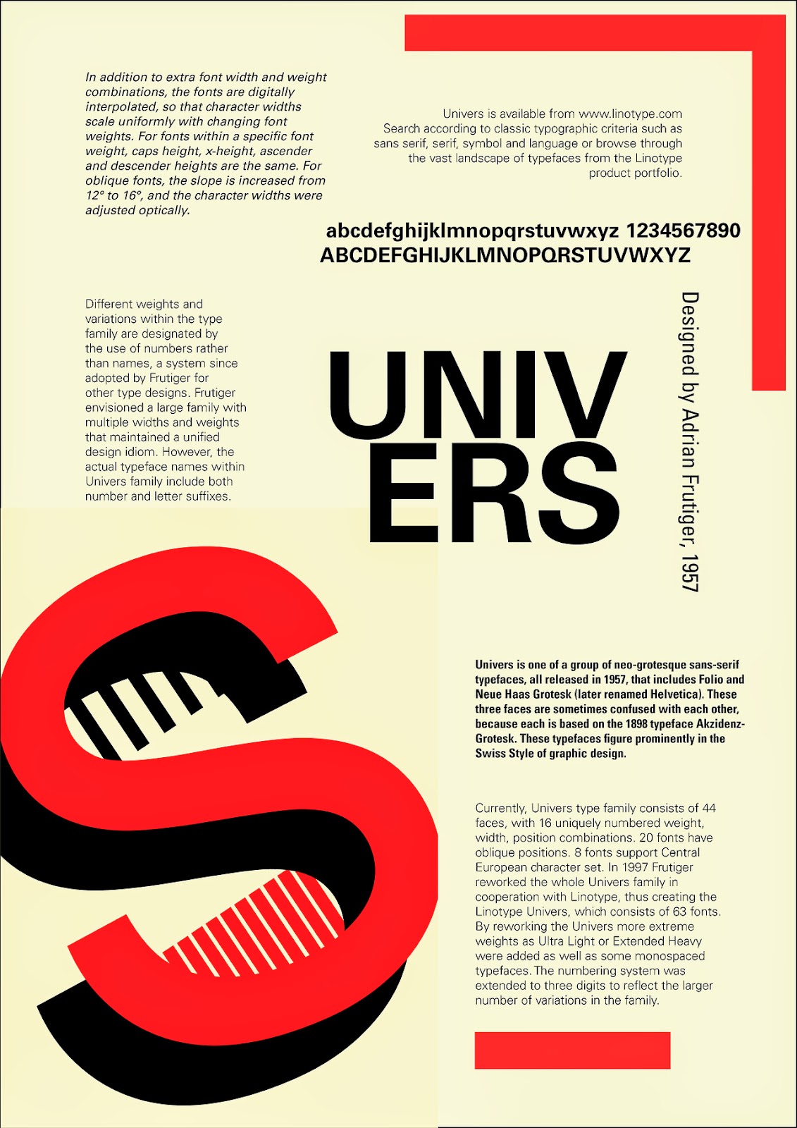
- Univers
- Gill

Subscribe to:
Posts (Atom)