Typography is something that I have never explored before coming to uni. I had no prior knowledge of it what so ever apart from font choice was important. I wasn't told which ones were good but knew that comic sans was bad. I have since been taught that;
- Garamond
- Didot
- Baskerville
- Times
- Futura
- Helvetica
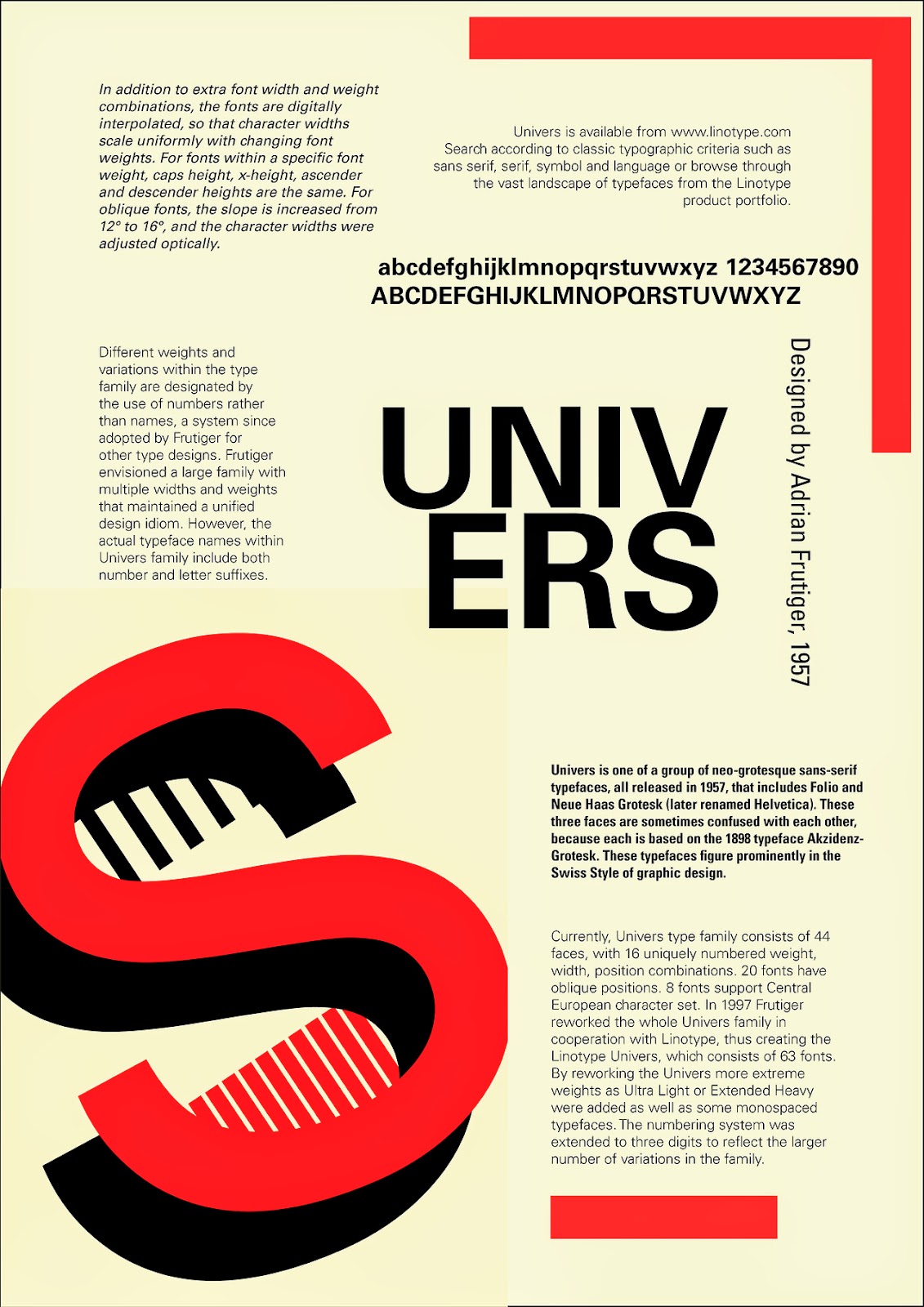
- Univers
- Gill
are all top notch quality fonts. I will never forget this. The amount of bad typefaces outways the good by 95% to 5%. Type is something I have explored more and more throughout the year. Above are the pieces from the 2nd type project of the year. They are poor examples of good type but I count them as a milestone.My typography improved and below is the my best marked piece of type that was featured on the course blog. It was called premier league typography.