Showing posts with label University of Cumbria. Show all posts

Saturday, 19 March 2016

from Cumbria with love


Cumbria post cards are now available from the University of Cumbria's Brampton Road campus and Moo Bar, Carlisle.

Hand on need Context don't you. A brief was by my fellow students to design a postcard to raise money for the cumbria flood relief and this above was my entry and below are the other entries. A pack is three pounds and all money raised will go to the relief effort.

It devastated the city I have called home for three years and I saw first hand he morning after the night before the devastation.  The roundabout, I go under to uni was eveloped and nearly went all of the way up to the top centre. Sainburys where a friend works was flooded. My friends in laws were flooded. My friends were flooded. Go to the relevant vendors and get yer postcards today
Photo stolen from Megan Brown, Soz bud.


Saturday, 5 March 2016

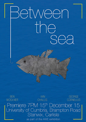
Sea no Fish

Just a quick little ditty about this project. A poster for a film by well you can read it on the poster. An unconventional looking fish in the middle of a big blue ocean almost being hooked in my man. This is the first time that I have used a light typeface as a header. Normally you want a bold and chunky font to catch peoples eye but this has subtly on it's side. I got paid for this job with Rose wine and Chocolates (The best alternative to cash in my opinion).

Thursday, 26 February 2015

Last night a DJ Saved My Life

Have you ever felt so proud of a piece of work you want to shout it from the rooftops, well that is something that I have just made. In uni I got given the job of developing a TV ident for a new TV channel that I have made. It won't get to telly but hey I wish it was a channel.

I chose to make a TV channel of vinyl records because they are my life outside of graphic design. Style wise it was initially based on the google play logo it has turned into an MTV bright light show. The dots are my love of litchenstein, most of the elements are hand drawn and the bright colours are because I have a little soft spot for design that visually attacks your eyes.  In the words of Miss Sophie Taylor (my bro) "I like it but it hurts my eyes"

Sunday, 14 December 2014

Cyan, Magenta, Yellow and Key (or black)

It's fun to stay at the C M Y K as one famous designer said. A famous designer who studied on my graphic design course at the university of cumbria. He chose a song that everyone knew to pay tribute to the colour scheme and I have just made a typography poster using a font that I have never used before (world first). I am a fan of these bright colours. which make up all of the printed images in an average printers.

Friday, 12 December 2014

The Official Opening

This blog post is the official opening of the James Reay Design website. It has been constructed and coded by my good self as part of a university project. It is a portfolio website and is there to display some of my most of my personal and as well as client based work. This is something that potential clients who are looking for designers will look at...if you are one of those people don't hesitate have a look. Click on the image below and prepare for a journey into the work of James Alexander Reay.


Wednesday, 26 November 2014

Magical Illustration Nation

Illustration is a thing that I am not very good at, never have been never will be. I like to draw but not illustrate. I have friends on the course that I am on, that can do this marvelously well. Magical Illustration Nation, Miss Sophie Taylor, can illustrate with great skill and I love her work This was her latest project as a one week comic. It's all about the love of the three C's; conventions, cosplay and (being) cool. 

Below are a few of my favourite panels from the comic. I went from not truly understanding the idea to loving the final result. Whats more is it was photocopied. King of the Photocopier approves. 


Sunday, 26 October 2014

The Big Reveal

Its all been very quiet on my blog recently but don't worry, its not because I don't love you people its because I have had a very stressful week taking photographs for my uni project. I thought I that I would use this opportunity to reveal, since it is nearly halloween, my costume. Prepare to start singing hits like "Jean Genie", "Drive in Saturday" and "Panic in Detroit". I am dressing up as a personal hero; David...Boowie? David Bowie. I mean....or do I?

Wednesday, 24 September 2014

the Bad, the Font and the change of opinion

 Bauhaus 93, I hate you. You are considered a cool and very fun and original font. I have seen you used on clubs and bars and posters. The general public uses you all the time but you have no redeeming features. You look nothing like any that was ever used by the Bauhaus school. the school that is one of the most important designs schools on the planet. ever. The Nazi's didn't like them but I do.


So I decided to take a stand and try and improve the reputation of the font as a mission. By making these typographic illustrations. The redeeming features of the font is that it bold and strong shapes to it thus making it easy to create images using the letter forms. This self initiated project is reminiscent of a type project that I did at uni and for the first week I did the project completely wrong. I was simply meant to make a pattern out of type and not an image.


Sunday, 7 September 2014

A Present Suprise


Presents come in all shapes and sizes. Some are thin, some are small, some are big, some are 3D. These presents are from my illustrator friend, Sophie. It illustrates the miss adventures that we got up to last year at uni making forts and sticking things...onto...my face. Simply done on a blue post it note with a marker pen, Fine Liner and Typex. I think that these are great and received the great news that more are to be done.


Monday, 14 July 2014

Not a Type-ical day

I have a bit of practical design experimentation during the course of the last week. It was based on the use of ink and typex. I had previously discovered that if you first write in typex then place ink on the top of it. it does not seep through onto the other side so you end up with a reverse letter form on the other side. So using this I tried this again but chose to do the whole alphabet to see how it looked. It was going to be a "grunge" typeface; not one that you would commercially use for a heading but for a one off piece. Once the process work had been done it looked like what you see below. So after that I drafted it into photoshop and made the negative space letter forms into positive space ones. which is what is next to the process work.

Once they were done, I did some one off works in this style to see what they would look like so these. I chose words that would be relevant to the style of the the font so "wet" and "Dirt" were chosen. These appear to be more successful due to them being bolder in weight and easier to read. I do like these and think the process was worth it to find out this out. 

Saturday, 7 June 2014

Speaking With Typography


 The Talking Heads are a great band. A fusion of Punk, World and funk music doesn't happen everyday. there movie Stop Making Sense is a flawless masterpiece showing the band the the peak of their creativity and musical diversity. All of them were art students and they all took calls from the arts for the music as well as the packaging. Bearing this in mind I made these posters influenced by 4 very different art styles as well as different designs that they have made.


Friday, 6 June 2014

A Present of Typography


The Wedding Present are just one of those great British bands whose refuse to quit. They have been active for many years and they still have the capacity to fill a decent size venue. They are independent of any of the big record companies which is evidence that you don't need them to survive. For all of these reasons they have had a big impact on me (that and they played a flawless gig in front of my very eyes).

To return the favour, I made these typography posters to demonstrate some of David Gedge's best lyrics. Each Poster features Lyrics from the best song on the album (in my opinion) and in one form or another a version of the album sleeve. These were self initiated designs but have sent them to the band but no feedback has been given.

Thursday, 5 June 2014

Highlights; Trying Something New


 Trying something new is always a good way to develop as a designer but doing so isn't always that easy. In uni, an entire unit was dedicated to doing exactly that. We were given two different designers or artists and we had to do pieces in the style of said person. Above you can see my work inspired by the great design guru; Chip Kidd, who is probably most well know for his logo for Jurassic Park. His main selection of work is in the design of high quality book jacket design. All of the above are mocked up potential book covers in the vain of what he would design.

Below, are selection of four different paintings/drawings that I did during the other part of this unit. I have not done any painting in many many years as secondary school kicked it out of me because they taught me nothing. These didn't turn out half as bad as I thought considering this fact. These pieces are in the style of Joan Eardley, a Scottish born artists who's main focus was landscapes and images of the poor youth.


Saturday, 31 May 2014

Highlights; Logo's

 As a designer it is wrong to have favourite projects but when a logo brief comes a long I really like it. It is always a challenge to try and fit an entire company's style and ethos into a single identity and for said identity to be seen everywhere.

This project at uni was creating several logos for stupid and silly companies that could never exist. I worked in collaboration with my friends Vincent, Sophie and an exchange student called 吴吴珊. We were set the challenge to make 9 logos (because our group was so big). We collectively got a decent grade out of all of our hard work. 

The approach for each of the logos was different and the style of each one had to be different for each. Working in collaboration made it easy to decide on which way to do each one was best.
Portable Double Bass
Faberge Scotch Egg

Night Club For Pensioners
Fighting Game for the Under Fives

Jamaican Cheese
Recycled Cardboard Robot
Tree Based Refreshment Drink
Turbo Charged Scooter from the Elderly

Lost Sock Detector