This week, My mum and dad were away on their holidays and when they leave me in control of the house; I have to do a project to further myself. It's odd. The last time they were away; I did RedesigningNE. This time, having done all the branding I feel comfortable shaking a stick at, I decided to improve my video skills. It was once suggested by a potential freelance design client; that I try a lyric video. I kinda took that note too far and made three lyric videos.
As regular readers of this blog will know (or you saw my post last week); Back to Basics are my (ex?) band. Well I was the song writer and drummer. Well...I mean...I wrote some songs and I played drums. It is/was one of the best things that I have ever done. I loved most of it (the second album sessions were difficult) and playing gigs in front of people is such a thrill.
I chose three songs from our first album because they are the most accessible and because they are the best recorded tracks. It was a pleasure listening to the tracks again; some bum notes, quite a few bits of speeding up and slowing down and some corny lyrics.
I made them in photoshop despite it being a limited video editor, it's functional and it saved me downloading and installing After Effects/Premiere Pro. I limited myself to one typeface; Gotham Bold (a different yet very functional font) because I wanted myself to challenge myself to make something exciting with something so limited.
Here are the tracks in order of creation;
Showing posts with label Photoshop. Show all posts
Showing posts with label Photoshop. Show all posts
Saturday, 17 September 2016
Friday, 5 December 2014

Friday, 28 November 2014
Water-Stain

I am not a grudge but I am well and truly annoyed at the moment with the tutors of Grillust, because of one simple error I was marked as a 45 with no constructive criticism to move forward with. Thank you guys. Really Helpful.
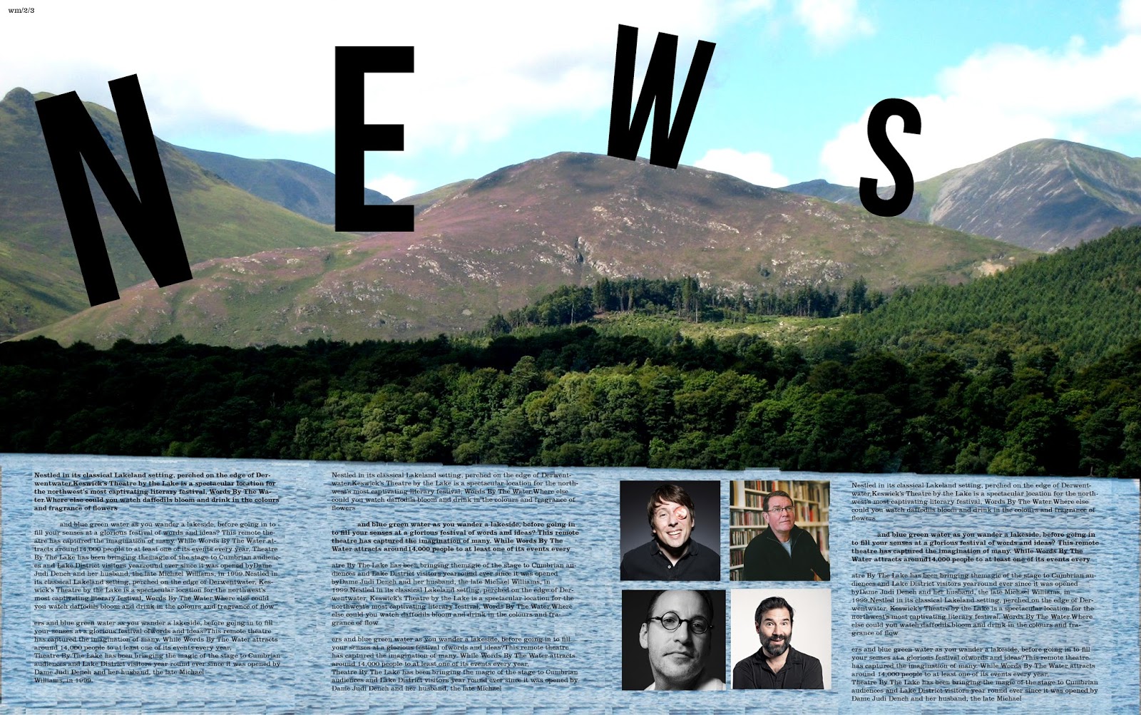
...Anyway, Watermark is a publication that is produced alongside the Keswick literary festival and our class has been given the opportunity to design this publication. There were many great designs on display during the sessions yesterday varying dramatically in terms of style, colour, approach, quality and ideas. Even with such an open brief, I never expected the level of creativity that was present. I ended up liking mine until it went to print and discovered that the type was too big so I have since fixed that. That is what can be seen here.
I managed to sneak an image of some of the cooler people from modern culture. Sue Perkins (cool Lady), Mark E Smith (Not a singer) as well as Adam and Joe (podcast kings).


Monday, 24 November 2014
Life Will Be the Death of Me

Picking up a simple knowledge of typography from my tutors, I experimented with how things are read, I am using the past tense on this because it is quite an old piece of typography which I have only just found on my laptop. I tested it out on my mother. If you ever need to test typography, try your mother.
Monday, 10 November 2014
Birthdays on a student budget.


Celebrating someones birthday is always a difficult task on a student budget. but with the power of photoshop the task of making a card for the occasion could not be simpler (if you remember to make a card; sorry vin). all you need is a cheesy selfie of the person and a nice font. simples. So in order. Sophie's card, Laura's card and Lucy's Card. These people are my uni friends and I do this out of love not out of being evil.
It was my 20th last week and I got a card back by Laura; seen above looking angry. It's hit a new level of crazy.

Tuesday, 30 September 2014
State of the Nation: Part 2


My last post on this subject got a great amount of coverage and success and I liked the idea very much. Having never read 1984 by George Orwell, I love the idea of the dystopian future ruled by the goverment, the thought of seeing these propoganda around us in the vintage 30's style would be amazing. However, in that situation I would be incapable of free thought and I would not be able to enjoy them as musch as I do know. The idea of these REALLY existing is laughable.Hope you like them. I do also enjoy controversial design hence some of the language I have used here is of that ilk.
Monday, 22 September 2014
Text is Motion


Text is a marvelous. Text is diverse. Text is fun. Text can demonstrate motion. That's what the above is all about. Words that normally just state what they mean, I have tried to demonstrate what these words mean. I chose a grey scale tone as not to distract from the message that I am trying to portray. Legibility in some of these are harder than others but hopefully all are still readable.
(Click the images for a closer inspection)
Monday, 15 September 2014
Back to Front, Front to Back


"Inspiaration have I none" is something that I have never said apart from when singing alng to David Bowie (wuzza Wuzz). My inspiration here was Tumblr; the website full of Hip, cool and young people, sharing images of funny animals, Fandoms and Mozza. I use it for mainly design and music.
Perspective, its all about it in these images. I have created a set of shapes that are all made of the same composite shapes but arranged in such away different images are made. If you look carefully; 2 repeats can be seen.
Monday, 14 July 2014
Not a Type-ical day
I have a bit of practical design experimentation during the course of the last week. It was based on the use of ink and typex. I had previously discovered that if you first write in typex then place ink on the top of it. it does not seep through onto the other side so you end up with a reverse letter form on the other side. So using this I tried this again but chose to do the whole alphabet to see how it looked. It was going to be a "grunge" typeface; not one that you would commercially use for a heading but for a one off piece. Once the process work had been done it looked like what you see below. So after that I drafted it into photoshop and made the negative space letter forms into positive space ones. which is what is next to the process work.


Once they were done, I did some one off works in this style to see what they would look like so these. I chose words that would be relevant to the style of the the font so "wet" and "Dirt" were chosen. These appear to be more successful due to them being bolder in weight and easier to read. I do like these and think the process was worth it to find out this out.

Once they were done, I did some one off works in this style to see what they would look like so these. I chose words that would be relevant to the style of the the font so "wet" and "Dirt" were chosen. These appear to be more successful due to them being bolder in weight and easier to read. I do like these and think the process was worth it to find out this out.
Shape of Design


Over the weekend, I spent a lot of my time on Photoshop experimenting with patterns and different typefaces to see what interesting combinations I could come up with. I have become a very big fan of Bebas, the typeface used in the first piece "The Candy Shop", only problem is it only has one weight. I have always wanted to use Gill Shadow but never had the chance so I have used this in the second piece "Good Mood". Shape tools have interested me too. I have utilized the line tool differently making it so the line is staggered and not just straight. This has been used throughout the pieces too.

Thursday, 10 July 2014
Photoshop Wanderings
Have your random Photoshop wanderings ever turned it to a towering cityscape at lunch time? Nope. Neither had mine until the other day. I started messing around trying to replicate a post modern piece of Graphic Design from a uni text book and ended up with this. So failing my intended target, I made a nice pretty picture for you all.

Subscribe to:
Posts (Atom)