This blog post is the official opening of the James Reay Design website. It has been constructed and coded by my good self as part of a university project. It is a portfolio website and is there to display some of my most of my personal and as well as client based work. This is something that potential clients who are looking for designers will look at...if you are one of those people don't hesitate have a look. Click on the image below and prepare for a journey into the work of James Alexander Reay.
Showing posts with label 2014. Show all posts
Showing posts with label 2014. Show all posts
Friday, 12 December 2014

Thursday, 11 December 2014
Fractured Magazine


Over the weekend I gave myself a brief, I gave myself a task, to design a magazine. Just the front cover as an identity breaker. I have started editoral at uni so the next step would be to approach the inside of the magazine but above is the start.
I found a really beautiful typeface in my font gallery which came in three seperate bits. Each letter form was split between the three of them (a normal version was included too). So the idea of seperated and an almost shattered typeface lead me to the name "fractured" as title for the zine, it was based on the style of zines from Wired, Clash or Little White Lies. Hipster but not outsider.
The Images are of some cult figures of TV and music. I would love to read articles on these beautiful people all of which have a close connection to my favourite radio station; BBC Radio 6 Music. I have been influnced by all and I would like to think that if this publication was real that they would like to read it.
an electric approach was needed to reflect the wide range of styles of the people present. the two tone chessboard for the specials front man, the warm colours for the soul man and the unique DJ listening to her self.
Monday, 1 December 2014
Panto-not-mine


Festive time is here again and there is nothing like celebrating with something relevant as well as something that has nothing really to do with me. HHHOOORRRAAAYYY!!! not.
This is not my project, This is Vincent Walden's which I hijacked for all of ten minutes and managed to turn to colours up as well as break the composition, mess around and still not be picked (not that they were ever entered as it wasn't my place to enter but still gave them a good put. Vincent does not want to claim ownership of the final thing as deems it to be not very good which I think given the spectrum of the brief a good effort was made.


Friday, 28 November 2014
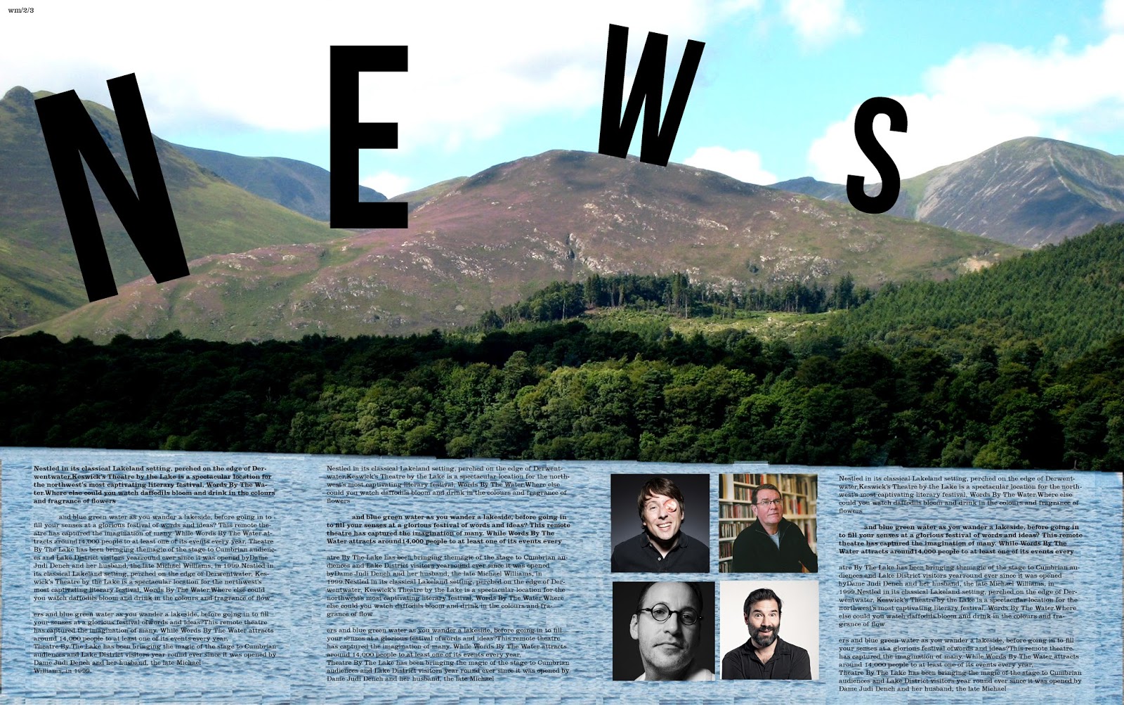
Water-Stain

I am not a grudge but I am well and truly annoyed at the moment with the tutors of Grillust, because of one simple error I was marked as a 45 with no constructive criticism to move forward with. Thank you guys. Really Helpful.
...Anyway, Watermark is a publication that is produced alongside the Keswick literary festival and our class has been given the opportunity to design this publication. There were many great designs on display during the sessions yesterday varying dramatically in terms of style, colour, approach, quality and ideas. Even with such an open brief, I never expected the level of creativity that was present. I ended up liking mine until it went to print and discovered that the type was too big so I have since fixed that. That is what can be seen here.
I managed to sneak an image of some of the cooler people from modern culture. Sue Perkins (cool Lady), Mark E Smith (Not a singer) as well as Adam and Joe (podcast kings).


Subscribe to:
Posts (Atom)