Showing posts with label typeface. Show all posts

Friday, 18 March 2016

This is not your type but mine

A vague Mumford and Sons reference to get this post going. Hooray 

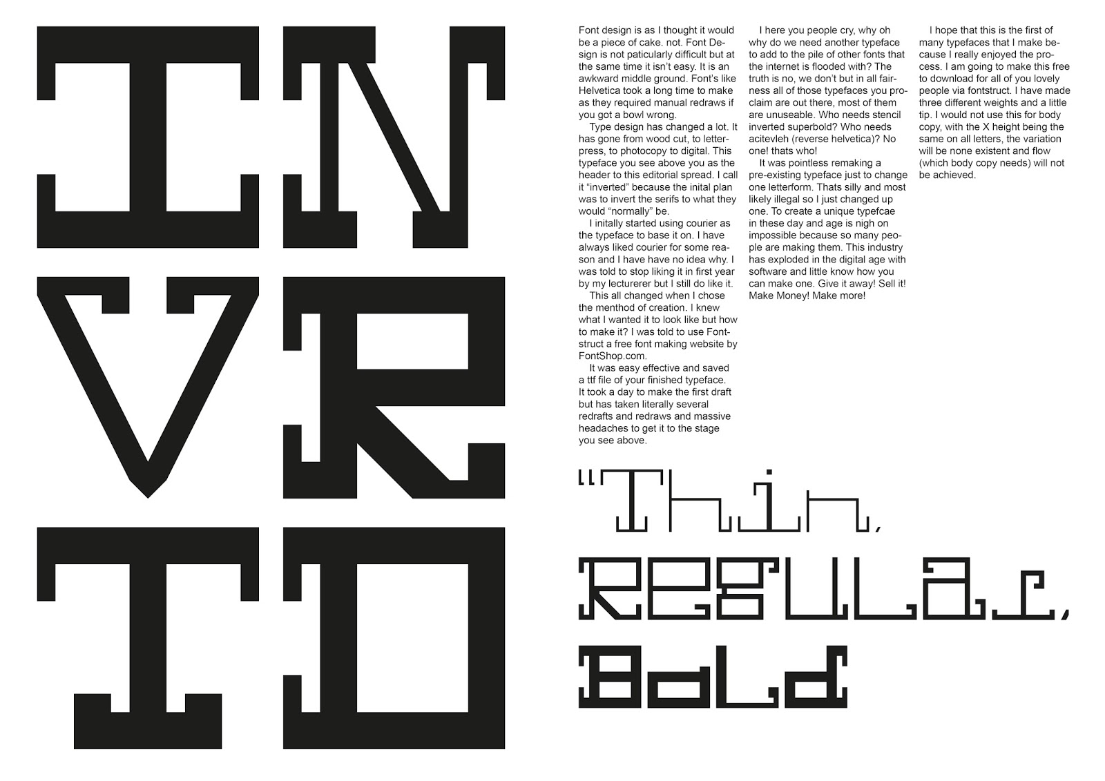
Font design is as I thought it would be a piece of cake. not. Font Design is not particularly difficult but at the same time it isn’t easy. It is an awkward middle ground. Font’s like Helvetica took a long time to make as they required manual redraws if you got a bowl wrong.

Type design has changed a lot. It has gone from wood cut, to letterpress, to photocopy to digital. This typeface you see above you as the header to this editorial spread. I call it “inverted” because the initial plan was to invert the serifs to what they would “normally” be. Click the images to see them closer

I initally started using courier as the typeface to base it on. I have always liked courier for some reason and I have have no idea why. I was told to stop liking it in first year by my lecturerer but I still do like it.

This all changed when I chose the method of creation. I knew what I wanted it to look like but how to make it? I was told to use Fontstruct a free font making website by FontShop.com. It was easy effective and saved a ttf file of your finished typeface. It took a day to make the first draft but has taken literally several redrafts and redraws and massive headaches to get it to the stage you see above.

I here you people cry, why oh why do we need another typeface to add to the pile of other fonts that the internet is flooded with? The truth is no, we don’t but in all fairness all of those typefaces you proclaim are out there, most of them are unuseable. Who needs stencil inverted superbold? Who needs acitevleh (reverse helvetica)? No one! thats who!

It was pointless remaking a pre-existing typeface just to change one letterform. Thats silly and most likely illegal so I just changed up one. To create a unique typefcae in these day and age is nigh on impossible because so many people are making them. This industry has exploded in the digital age with software and little know how you can make one. Give it away! Sell it! Make Money! Make more! But before you do here it is in action;

I hope that this is the first of many typefaces that I make because I really enjoyed the process. I am going to make this free to download for all of you lovely people via fontstruct. I have made three different weights and a little tip. I would not use this for body copy, with the X height being the same on all letters, the variation will be none existent and flow (which body copy needs) will not be achieved.

Download all three weights here

Wednesday, 11 February 2015

My NEW Obsession

  "Obsessions come and go weeks ago it was courtney barnett and now it is these posters. its helping my sharpen up my layout ability, as well as font choices and weights and colour. and important part of any design me thinks.
     It is an exercise that I created which is to simply use the date and the time as your header text and use lorem ipsum as your body copy and to create and interesting composition. now I have included an additional element: shapes and the may one day influence a final piece or just simply be there. I will be most pleased to see this having an effect on the way I work in the future. I am constantly striving to improve as a designer and/or as a person."


Tuesday, 10 February 2015

My NEWER obsession

 " Obsessions come and go weeks ago it was courtney barnett and now it is these posters. its helping my sharpen up my layout ability, as well as font choices and weights and colour. and important part of any design me thinks.
     It is an exercise that I created which is to simply use the date and the time as your header text and use lorem ipsum as your body copy and to create and interesting composition. the may one day influence a final piece or just simply be there. I will be most pleased to see this having an effect on the way I work in the future. I am constantly striving to improve as a designer and/or as a person. "


Monday, 9 February 2015

My NEWEST obsession

     Obsessions come and go weeks ago it was courtney barnett and now it is these posters. its helping my sharpen up my layout ability, as well as font choices and weights and colour. and important part of any design me thinks.
     It is an exercise that I created which is to simply use the date and the time as your header text and use lorem ipsum as your body copy and to create and interesting composition. the may one day influence a final piece or just simply be there. I will be most pleased to see this having an effect on the way I work in the future. I am constantly striving to improve as a designer and/or as a person. 


Tuesday, 6 January 2015

Alphabetter


 The alphabet. letters used to spell the words that we say and the words that we write. Not universal to every culture but the 26 letters are the letters of my culture. stretching from A to Z. letters are universal to everyone in this culture but typeface and presentation is not. Handwritting is different depending on the person, typeface preferences also vary person to person and I now here you ask why are you saying all of this.

I before new year went a little bit mad and using the idea of negative letter spaces, outlines only. made posters of letters, letters of the alphabet. starting with the first 6. colours change, layouts change, but treatment remain the same. the result varies and some interesting ideas have been achieved and garnered, i am not one to blow my own trumpet but these are good posters me thinks.

click to investigate them closer or just see the madness from the distance you see them now.


Monday, 5 January 2015

are you TALKING to my HEADS?


this band are a constant stream of influence every time you put on a record of theirs you hear something new even on the 20th listen. Speaking in Tongues is the best. anyway... these are the result of my last listening session to remain in light and fear of music. "Stop Making Sense is one of the best lyrics from a song ever. Life During wartime is one of the best songs from them. I implore anyone to have a fear of music the thing that I love more than anything apart from the obligatory friends and family.

A clean fresh colour scheme that resembles the sound you hear when you first hear the band. the white space that resembles the minimalism involved in their compositions and the typeface, it's just a beautiful typeface that I used to hate.


Thursday, 11 December 2014

Fractured Magazine


 Over the weekend I gave myself a brief, I gave myself a task, to design a magazine. Just the front cover as an identity breaker. I have started editoral at uni so the next step would be to approach the inside of the magazine but above is the start.

I found a really beautiful typeface in my font gallery which came in three seperate bits. Each letter form was split between the three of them (a normal version was included too). So the idea of seperated and an almost shattered typeface lead me to the name "fractured" as title for the zine, it was based on the style of zines from Wired, Clash or Little White Lies. Hipster but not outsider.

The Images are of some cult figures of TV and music. I would love to read articles on these beautiful people all of which have a close connection to my favourite radio station; BBC Radio 6 Music. I have been influnced by all and I would like to think that if this publication was real that they would like to read it.

an electric approach was needed to reflect the wide range of styles of the people present. the two tone chessboard for the specials front man, the  warm colours for the soul man and the unique DJ listening to her self.

Monday, 1 December 2014

Panto-not-mine


 Festive time is here again and there is nothing like celebrating with something relevant as well as something that has nothing really to do with me. HHHOOORRRAAAYYY!!! not.

This is not my project, This is Vincent Walden's which I hijacked for all of ten minutes and managed to turn to colours up as well as break the composition, mess around and still not be picked (not that they were ever entered as it wasn't my place to enter but still gave them a good put. Vincent does not want to claim ownership of the final thing as deems it to be not very good which I think given the spectrum of the brief a good effort was made.


Friday, 14 November 2014

society has got it all wrong

I get really tired of ignorance when it comes to sexuality and gender. I am a hetrosexual man as far as I am concerned and I, in society, have it so easy. I don't have to worry about all of the rubbish that homosexuality brings. Tragic really in this modern age. But I believe that using the power of my art form I should promote an equality for all. I have done posters promoting love is love and to stop homophobia. These are on the same note. But not quite.

I am a big believer in, be who you are and as long as you are awesome you will be my friend. Society can't accept that. It wants to make everyone like robots; look the same and do the same things. which is saddening to say the least. Individuality makes people better. David Bowie wouldn't of made it if he was the same as every else and we all love him. (if you don't get off my blog). The point being you be who you are. If you aren't you will only hurt yourself.

Hope you like them, stay awesome, stay true to yourself


Monday, 10 November 2014

Birthdays on a student budget.


Celebrating someones birthday is always a difficult task on a student budget. but with the power of photoshop the task of making a card for the occasion could not be simpler (if you remember to make a card; sorry vin). all you need is a cheesy selfie of the person and a nice font. simples. So in order. Sophie's card, Laura's card and Lucy's Card. These people are my uni friends and I do this out of love not out of being evil.

It was my 20th last week and I got a card back by Laura; seen above looking angry. It's hit a new level of crazy.

Saturday, 11 October 2014

formed a band and had loads of good fonts

if typefaces were instruments they would probably would read like this. The typeface is in red and the additional characters that they require to name the instrument. enjoy.