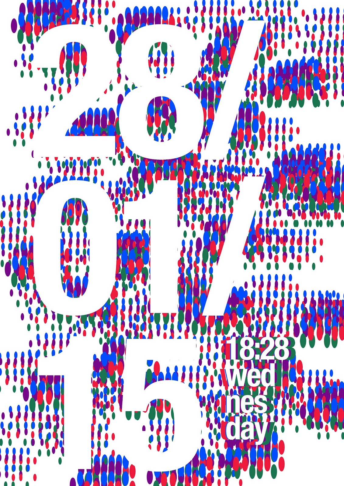
It is an exercise that I created which is to simply use the date and the time as your header text and use lorem ipsum as your body copy and to create and interesting composition. now I have included an additional element: shapes and the may one day influence a final piece or just simply be there. I will be most pleased to see this having an effect on the way I work in the future. I am constantly striving to improve as a designer and/or as a person."


