Showing posts with label Vintage. Show all posts

Tuesday, 11 August 2015

Gun Flaws

 America, I love you. You have created many of the things I love. Your Punk Rock was amazing. Rock and Roll spawned from your shores but you are letting the side down with your homicide rate. Homicide; the act of a human being causing the death of another human being. Especially via guns. Now I know you love them but there are times when you can protect yourself from a so called threat by using other methods of protection. 

Now there are a few things that may be to blame.;
  •  Maybe you are violent people; nope other countries have had just as a violent past as you guys and they don't have a mass shooting every other week.
  • Maybe you guys play violent video games; nope, the same games are played all over the world.
  • Maybe you have violent hip hop and rock music that is teaching young people that guns are cool; nope, this music is widely available in other countries too. 
Maybe you guys have a 2nd amendment that gives you the right to bear arms; you do but that doesn't mean you have the right to kill anyone. But accidents do happen when you keep a killing machine under your bed. Maybe you have an association that promotes guns and refuses to accept that murder using said weapons means they need to be regulated. oh yeah, you do and it annoys me so much.

the people who want to regulate and put controls on your guns are not evil they just want to stop people who carry out the mass shootings with your favourite thing. they don't want to take them away. So let the below be a warning to you and your unfair behaviour to straighten up and take a little bit of regulation to save the people of your nation. The press does say you are an exclusive organization of angry white men & I believe them all the way.

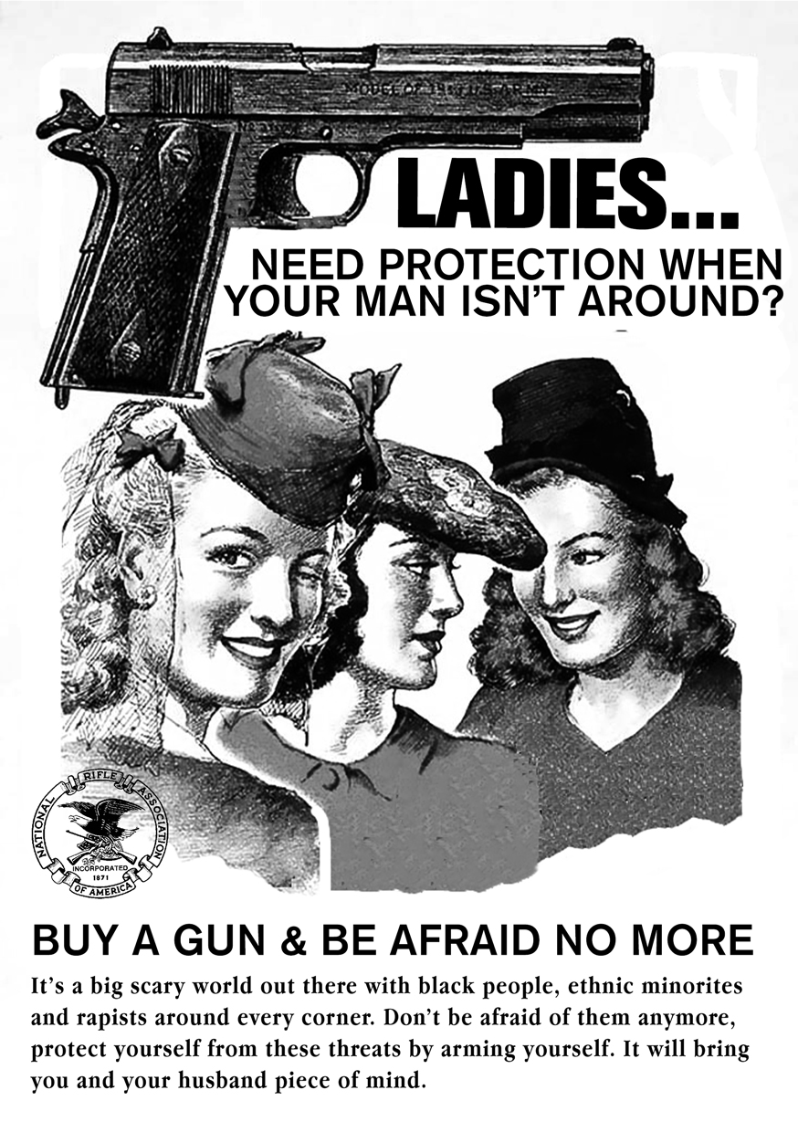
Anyway, in design terms these are themed like 1940's style newspaper ads, when the good time supposedly were, and are for the NRA (national rifle association). They are racist, sexist as well as in appropriate to be provocative. it tends to make people listen when you over step the mark.


Thursday, 26 February 2015

Last night a DJ Saved My Life

Have you ever felt so proud of a piece of work you want to shout it from the rooftops, well that is something that I have just made. In uni I got given the job of developing a TV ident for a new TV channel that I have made. It won't get to telly but hey I wish it was a channel.

I chose to make a TV channel of vinyl records because they are my life outside of graphic design. Style wise it was initially based on the google play logo it has turned into an MTV bright light show. The dots are my love of litchenstein, most of the elements are hand drawn and the bright colours are because I have a little soft spot for design that visually attacks your eyes.  In the words of Miss Sophie Taylor (my bro) "I like it but it hurts my eyes"

Saturday, 22 November 2014

The Photocopier is my Screen

 The Photocopier is my screen. Andy is my hero so I combined the too. Having been crowned king of the photocopier by illustration station cos I am always photocopying things. I decided to experiment more with the potential of the copier. Using the one colour filter I made the above. it simply screens a colour cast over the image. The image of Andy was from the i Paper as it was a review of his exhibition in Liverpool, which I must must must go to.
Now Andy's probably most famous piece is Marilyn and these are Andy as the Marilyn's , at least my interpretation. Using a photopied image and a marker pen set. One is the colour version, when he was in the star light and the other, the black and white as his starlight starts to dwindle as well as his mortality, having died twice.

Thursday, 13 November 2014

Beauty comes in my shapes and sizes

That's my feet
That's my feet again

The 1960's were a time of innovation. in art, in fashion and in music. and to stumble upon an artifact of this time was a happy accident. Motif was an art magazine for the 1960's to preview art from that period. I chose Motif 10 over the others because Sir Peter Blake designed it. This man designed Sgt Pepper so this man is a legend. Below are a few spreads from the book that I found most appealing.
 It cost me £5 and it was worth every penny in my opinion. 


Tuesday, 30 September 2014

State of the Nation: Part 2


My last post on this subject got a great amount of coverage and success and I liked the idea very much. Having never read 1984 by George Orwell, I love the idea of the dystopian future ruled by the goverment, the thought of seeing these propoganda around us in the vintage 30's style would be amazing. However, in that situation I would be incapable of free thought and I would not be able to enjoy them as musch as I do know. The idea of these REALLY existing is laughable.Hope you like them. I do also enjoy controversial design hence some of the language I have used here is of that ilk. 


Monday, 8 September 2014

State of the Nation

Satire is one of the things that I do enjoy a lot. so instead of doing some music related design, I did a piece of design based on this concept. These posters are based on the idea of a dystopian state run
future, very similar to the world that George Orwell imagined in 1984 and David bowie used as the concept for Diamond Dogs. The original design style harks back to the 1930's style of newspaper ads. I chose this style because it is the one that is used in Fallout; the video game about a nuclear future.


Sunday, 10 August 2014

Everything is a Conspiracy

 I am skeptical bout everything, I source every like on Social media to see if it is from a REAL person or just a spam account used to generate more likes or comments. I have become more skeptical in recent years about who is ruling the people of this earth. In an age of wiki leaks and Secret services it's hard to take things as they come. So when  had the chance to design for an album about this very interested. It's a home grown project but that makes it no less credible.

The iconography of war first came to mind when this was brought to my attention. hence some parts of the design depicting war. I feel very passionately about the mistakes that the UK made to go into Iraq. The monoo chrome style came very much out of the punk politics and fanzine culture around that time. Saying stand up and have a voice, Print your message using the cheap photocopiers and a pen. The display typeface is Helvetica but the other one is called Karton and it looks like the font Crass (the Band) used to use.


Monday, 21 July 2014

Put the Needle on the Vintage Record

My love of music seems to seep into every post I do and this one is no exception. I have taken it upon myself to start a very expensive hobby; Vintage Record Player collecting. Below you can see my first rescued baby; a Fidelity HF45. She is a early 1970's machine, designed to look like and early 60's Dansette player. Me and my father repaired it as it had a noisey volume knob. It now works fine and looks absolutely beautiful.