Showing posts with label experimental. Show all posts

Friday, 29 April 2016

You Spin Me Round (Like a Record)

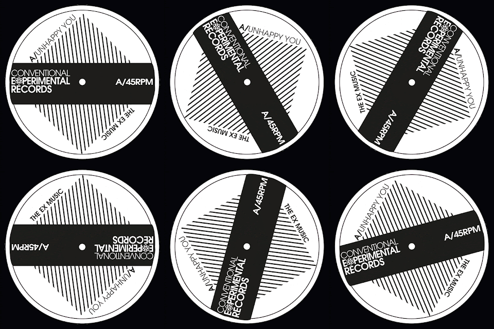
 Been making gifs today if you can't already tell. Both of these gifs are for my fictional post punk record label "Conventional Experimental Records"; named after the line in The Mighty Fall song "New Puritan" which is my favourite Fall song (at the minute). It flickers between Jawbone and the Air rifle (album version), The N.W.R.A (album version) or New Puritan (Peel Session).

Anyway, Got Side tracked. I have been meaning to make these gifs because with this being a record company the main output of the label will be records and what do records do; spin. Gifs have come back into popularity with recent introduction to social media. They were a very thing because all websites used them to get that "cutting edge" look because web pages were just static; now they have so many elements that move; they aren't needed as much.

I hope to add these to my website to add movement to portfolio of awesome work (if I say so myself).


Tuesday, 22 March 2016

At the Record Company Meeting, on our hands are new star.

Punk has always been a source of inspiration for yours truly. But for this project it was it's after effect that inspired this project. Post Punk was just incredible; I am still finding new albums that just pushed the punk's spirit so far that it became jazz. Punk and Jazz are just opposites who would of thought they'd work so well. The Contortions, The Pop Group even X Ray Spex with honking of sax on Oh Bondage, up yours! just seems still illogical but it works.

Post punk seemed to reject the punk look but keep it's spirit and that is what I have tried to do here. It's lo fi enough to have been done in the budget restraints of a punk group but keeps it's class by not been a photocopy of a photocopy with a coffeee stain see punk fanzines. A lot of post punk was about bright colours; the work of Barney Bubbles could only of existed in this limbo between scenes but this was just meant to be simple and cheap.

I have created the base set of everything you really need to start a record company; the logo, the company sleeve in which your records go & the label that goes on the record. I have done a poster with my made up bands names that are on the label. Bands Like; The
  Ex Music, Tempo//Tempo and Higgs Boson.


Thursday, 11 December 2014

Fractured Magazine


 Over the weekend I gave myself a brief, I gave myself a task, to design a magazine. Just the front cover as an identity breaker. I have started editoral at uni so the next step would be to approach the inside of the magazine but above is the start.

I found a really beautiful typeface in my font gallery which came in three seperate bits. Each letter form was split between the three of them (a normal version was included too). So the idea of seperated and an almost shattered typeface lead me to the name "fractured" as title for the zine, it was based on the style of zines from Wired, Clash or Little White Lies. Hipster but not outsider.

The Images are of some cult figures of TV and music. I would love to read articles on these beautiful people all of which have a close connection to my favourite radio station; BBC Radio 6 Music. I have been influnced by all and I would like to think that if this publication was real that they would like to read it.

an electric approach was needed to reflect the wide range of styles of the people present. the two tone chessboard for the specials front man, the  warm colours for the soul man and the unique DJ listening to her self.

Sunday, 7 December 2014

Two Turntables and a Microphone

Classic Hip Hop is something that I have been getting into a lot lately. Namely a Tribe Called Quest, De La Soul and Public Enemy. All of which where made using the recipe above; two turntables and a microphone, is a line in a Mantronix song which was indeed sampled by the man and the oddity, Beck on his track "Where it's at". I love them bands as well as Beck and I love the idea of sampling and editing from the glorious vinyl.

Wednesday, 3 December 2014

shattered (sh dooby)

CMYK a colour scheme I should use more, it can produce a lot of interesting ideas. Breaking Glass was a good idea that Nick Lowe had it some point in the late 70's and thats what this looks like in my opinion. Messing around with various shapes and colours lead me to something that looks like a stain glass window shattering into oblivion as well as into a million pieces. Chaos and design as two things that should go hand in hand in my humble opinion.

Sunday, 30 November 2014

Love Can Mend your Life, But Love Can Break your Heart


It means so much to so many people, Its not exclusive to any gender or sexual orientation, it is universal. You would not be reading this is if it did not exist, it provides peace, stability and happiness to millions everywhere and its not hard to see why.

I made these pieces for Leeds College of art as a test to get an interview and it seemed I passed with 2 colours and a white but I didn't like the uni anyway. But these have always struck a chord with me. working and positive and negative space, the simple and the conceptual. Even at that stage, I knew love was important hence the reason for choosing the heart. I had gone through my first break up by this point so I knew how it felt and what it meant so experience made these ring even more true.


Saturday, 29 November 2014

Carson, Not Even Once

At this stage in my graphic design career had never heard of David Carson, the master of grunge typography and the publisher of raygun magazine. I simply knew how to manipulate things in photoshop and thought what I can do with images I can sutrely do with type. So I did and these are the results. 

As I have developed an interest in type, I can see that they have carson written all of over them. He knew nothing about type when he made his pieces and at this stage (late college) neither did I so I once had something in common with a typographic genius. He broke the rule and and I may very well of done but how could I know I was breaking them without knowing of there existence.  This means that I can become one too. Maybe. Probably not. but maybe.


Friday, 28 November 2014

Water-Stain


 I am not a grudge but I am well and truly annoyed at the moment with the tutors of Grillust, because of one simple error I was marked as a 45 with no constructive criticism to move forward with. Thank you guys. Really Helpful.

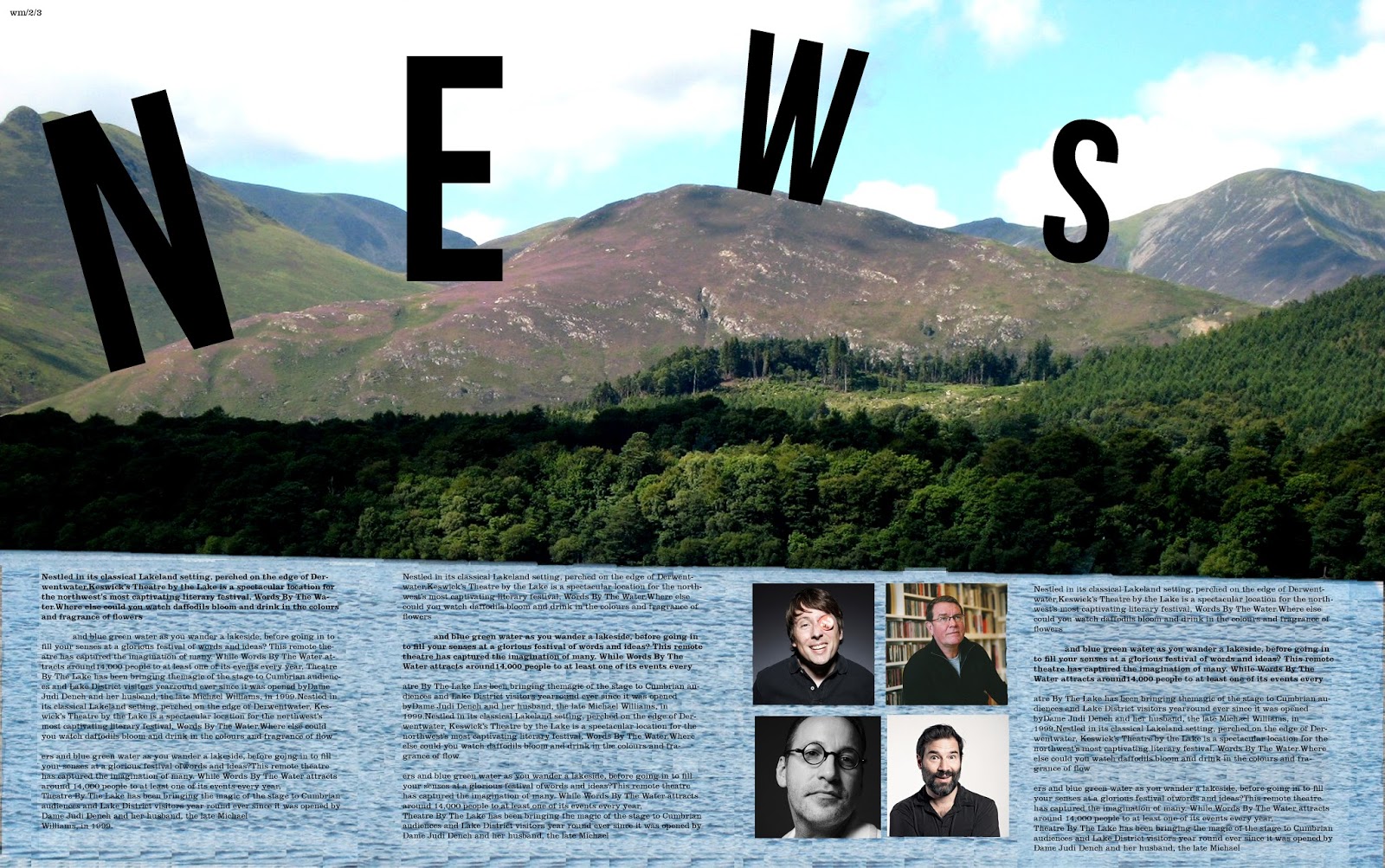
...Anyway, Watermark is a publication that is produced alongside the Keswick literary festival and our class has been given the opportunity to design this publication. There were many great designs on display during the sessions yesterday varying dramatically in terms of style, colour, approach, quality and ideas. Even with such an open brief, I never expected the level of creativity that was present. I ended up liking mine until it went to print and discovered that the type was too big so I have since fixed that. That is what can be seen here.

I managed to sneak an image of some of the cooler people from modern culture. Sue Perkins (cool Lady), Mark E Smith (Not a singer) as well as Adam and Joe (podcast kings).


Monday, 24 November 2014

3/4, 3/4, 3/4, 3/4, 3/4, 3/4, 3/4, 3/4, 3/4, 3/4, 3/4, 3/4, 3/4, 3/4, 3/4, 3/4, 3/4, 3/4, 3/4, 3/4, 3/4, 3/4, 3/4

Scottish psychedelic indie rock band, sound great and indeed it is. So I asked the staff at the brickyard if I could so the poster and they were more than happy to let me. psychedelia requires a bit of warp and movement to it hence the image repetition. The bands logo, I actually think words really well for the band despite being an unusual typeface choice. The colours and the colours of the band them selves. Its almost very pro union, (if they did have an opinion in the referendum) but this also works for them. They sound a lot like temples and they are really big right now I have no idea why these guys aren't. This is one gig I will be attending. If indeed I can.

My Compliments to the Chef

I have beautifully unique and strange friends who express friendship in very peculiar ways. This was a "compliment " give to me today and I dare say I don't quite understand it's premise. I think it is because I have a very experimental approach to design and how I use the programs. It is not for me to explain what it is that I am to you. or do I? answers on a postcard please

Saturday, 22 November 2014

The Photocopier is my Screen

 The Photocopier is my screen. Andy is my hero so I combined the too. Having been crowned king of the photocopier by illustration station cos I am always photocopying things. I decided to experiment more with the potential of the copier. Using the one colour filter I made the above. it simply screens a colour cast over the image. The image of Andy was from the i Paper as it was a review of his exhibition in Liverpool, which I must must must go to.
Now Andy's probably most famous piece is Marilyn and these are Andy as the Marilyn's , at least my interpretation. Using a photopied image and a marker pen set. One is the colour version, when he was in the star light and the other, the black and white as his starlight starts to dwindle as well as his mortality, having died twice.

Monday, 22 September 2014

Text is Motion

 
Text is a marvelous. Text is diverse. Text is fun. Text can demonstrate motion. That's what the above is all about. Words that normally just state what they mean, I have tried to demonstrate what these words mean. I chose a grey scale tone as not to distract from the message that I am trying to portray. Legibility in some of these are harder than others but hopefully all are still readable.

(Click the images for a closer inspection)


Thursday, 18 September 2014

Opposites Will Happen


 Opposites have always played a big part of design. and in the way of the world it is said that opposites attract. One of my favourite words is associated with opposites; Juxtaposition.

"the fact of two things being seen or placed close together with contrasting effect."

I have applied this here in these posters to promote being proud of who you are. Placing the positive element on what is considered to be a negative aspect as well as reinforcing this by placing a bland colour onto what would be considered the prefered characteristic. 

We don't have to follow what is considered to be a good thing. we can be whoever we want to be. This message is all shown in my favourite new font "Ostrich sans".


Monday, 15 September 2014

Back to Front, Front to Back


"Inspiaration have I none" is something that I have never said apart from when singing alng to David Bowie (wuzza Wuzz). My inspiration here was Tumblr; the website full of Hip, cool and young people, sharing images of funny animals, Fandoms and Mozza. I use it for mainly design and music.

Perspective, its all about it in these images. I have created a set of shapes that are all made of the same composite shapes but arranged in such away different images are made. If you look carefully; 2 repeats can be seen.


Sunday, 17 August 2014

Light Show


I fell in love with this effect. So I made a poster with it. Its a lens flare effect, copied and offset with the colours turned up so that they are brighter. Sounds easy, was easy and looks fancy.

Sunday, 10 August 2014

Everything is a Conspiracy

 I am skeptical bout everything, I source every like on Social media to see if it is from a REAL person or just a spam account used to generate more likes or comments. I have become more skeptical in recent years about who is ruling the people of this earth. In an age of wiki leaks and Secret services it's hard to take things as they come. So when  had the chance to design for an album about this very interested. It's a home grown project but that makes it no less credible.

The iconography of war first came to mind when this was brought to my attention. hence some parts of the design depicting war. I feel very passionately about the mistakes that the UK made to go into Iraq. The monoo chrome style came very much out of the punk politics and fanzine culture around that time. Saying stand up and have a voice, Print your message using the cheap photocopiers and a pen. The display typeface is Helvetica but the other one is called Karton and it looks like the font Crass (the Band) used to use.


Thursday, 17 July 2014

Sketchbooking

I am not an illustrator, do not get that impression from these drawings. These little fragments are from my sketchbook. I do quite like to doodle, especially on train journeys to and from home. I'd like to use these at some point for something or other but I don't know how and I don't know when. I have "corrected" them by some basic editing and sharpen them up so that they look presentable. when I draw I am not looking for a style because that will one day come to me.