Bauhaus 93, I hate you. You are considered a cool and very fun and original font. I have seen you used on clubs and bars and posters. The general public uses you all the time but you have no redeeming features. You look nothing like any that was ever used by the Bauhaus school. the school that is one of the most important designs schools on the planet. ever. The Nazi's didn't like them but I do.
So I decided to take a stand and try and improve the reputation of the font as a mission. By making these typographic illustrations. The redeeming features of the font is that it bold and strong shapes to it thus making it easy to create images using the letter forms. This self initiated project is reminiscent of a type project that I did at uni and for the first week I did the project completely wrong. I was simply meant to make a pattern out of type and not an image.
Showing posts with label bauhaus. Show all posts
Showing posts with label bauhaus. Show all posts
Wednesday, 24 September 2014
Wednesday, 21 May 2014
highlights part 2: Typography
Typography is something that I have never explored before coming to uni. I had no prior knowledge of it what so ever apart from font choice was important. I wasn't told which ones were good but knew that comic sans was bad. I have since been taught that;
- Garamond
- Didot
- Baskerville
- Times
- Futura
- Helvetica
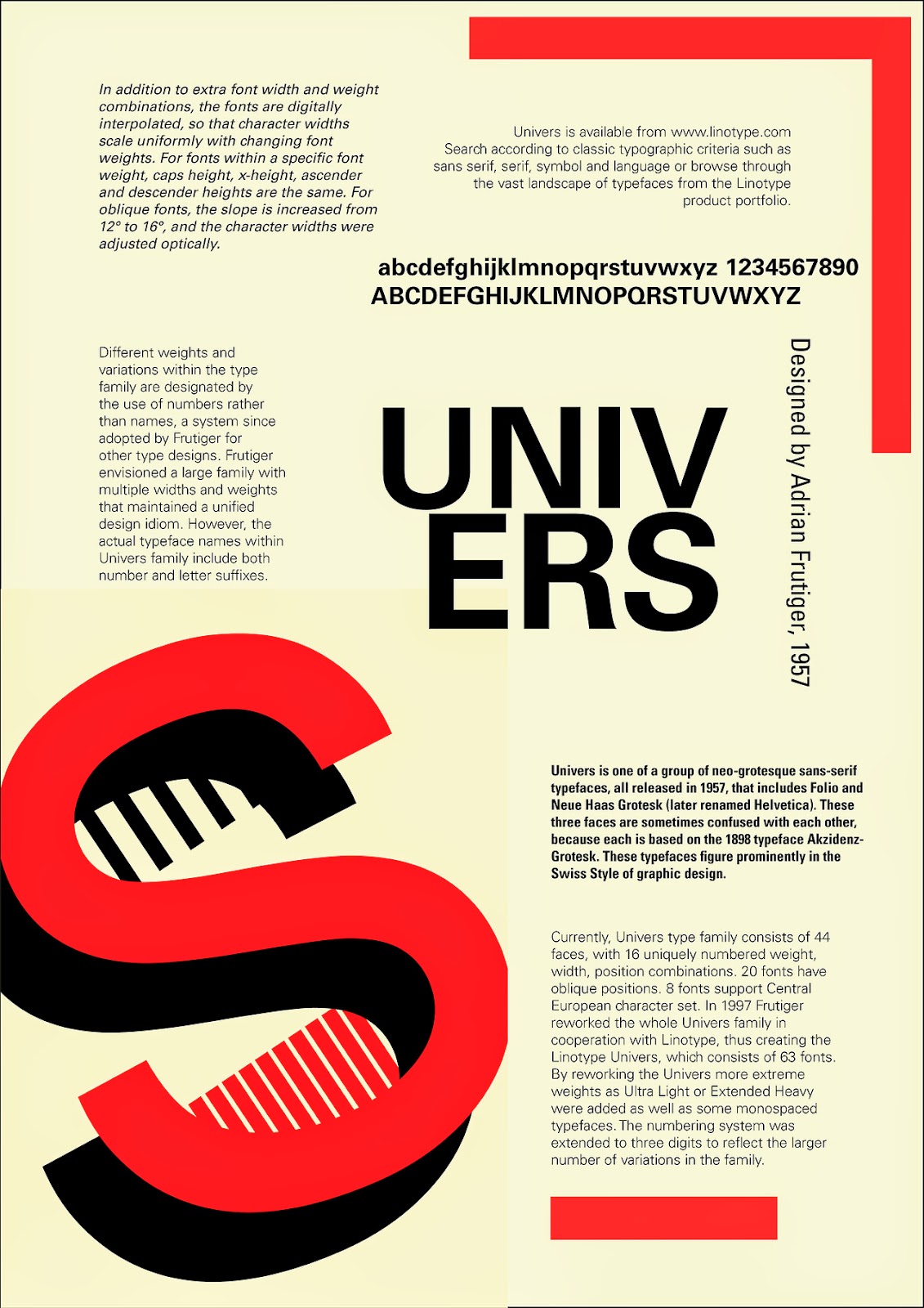
- Univers
- Gill
Subscribe to:
Posts (Atom)


