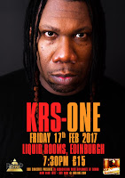
When given photo options for the hip hop heavyweight I didn't expect to choose this one. The photo options were limited and not print quality but I digress. I love this portrait of Mr KRS and I also love Compacta (the font used). There was limited space so the text needed say everything in the most space effective way possible hence the use of Compacta, a tall and bold sans serif.
The first thing my dad said on seeing the first draft that the colours of the text, truth be told I kinda stole the colours from this obscure RSD Bob Dylan Compilation called Side Tracks.
The poster once was bare on the bottom right and left corner but after being sent off to the agency it needed his latest album cover to the bottom right and the agency logo on the left. I was first skeptical about how nice it looked but on the final version of I think it still looks smashing.
What made this project an extra level of special was that is was a multiple date poster job so had the pleasure of doing a poster for Edinburgh and Leeds as well as the Newcastle date.


No comments:
Post a Comment