Friday 29 April 2016

You Spin Me Round (Like a Record)

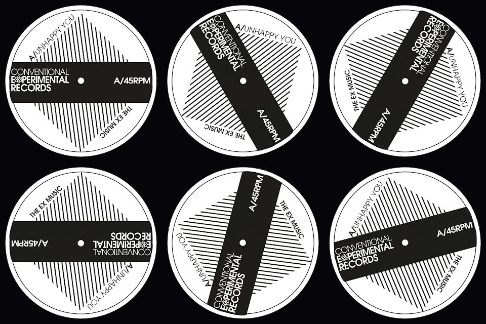
 Been making gifs today if you can't already tell. Both of these gifs are for my fictional post punk record label "Conventional Experimental Records"; named after the line in The Mighty Fall song "New Puritan" which is my favourite Fall song (at the minute). It flickers between Jawbone and the Air rifle (album version), The N.W.R.A (album version) or New Puritan (Peel Session).

Anyway, Got Side tracked. I have been meaning to make these gifs because with this being a record company the main output of the label will be records and what do records do; spin. Gifs have come back into popularity with recent introduction to social media. They were a very thing because all websites used them to get that "cutting edge" look because web pages were just static; now they have so many elements that move; they aren't needed as much.

I hope to add these to my website to add movement to portfolio of awesome work (if I say so myself).


Thursday 28 April 2016

Wish I Could Be like David Carson

When I first saw his work I had no idea what to think. It was so different. I was only introduced to it in my first year at university. 2013. 20 years plus after it was initially published. 20 years after it was fresh. But it struck a chord. This work didn't look legible. The text was so abstract. Put it on on a Jackson Pollock painting and it would fit in.  It becomes legible once you understand the motivation behind the work. It was all about feel and look not whether you could "read it" traditionally.
This book is like a "best of" compilation of his early work.
I have watched many of his talks online. Most repeat stories but they all just show an honest bloke talking frankly about the work he has done. And that's fascinating because it seems initially that big designers are rockstars or the visual world but to see a so called "big designer" being like everyone else. In one lecture he says you can actually ring him or email him and he will reply. That's better than most job sites offer at the minute (am I right?).

What I am trying to say is I like his work and his approach to fans/other designers. If or when I get more well known I want to keep this approach. David Carson, you set a great example.

Thursday 21 April 2016

Why I love underworld

A band who are relatively new to me despite having some age to them. Designers, artists musicians, underworld have been around since the 80s but became rather explosive in the 90s with rave culture. And the bside with 4 additional letters NUXX exploded on the soundtrack to trainspotting. I have only listen to a couple of their LPs but I have so much love for them it just seems logical to like the band.
Musically it's dance but not as you know it. It's more sophisticated than a lot of the bands going for this. The songs have phases rather than just drop after drop but don't get me wrong Rez does that latter formula so well. The lyrics aren't average of dance tracks either. Declaring love for skyscrapers being the prime example.

For one moment I want to talk about Karl Hyde, now not to inflate his ego if he ever reads this but his voice seems to reference the best of alternative music. Hear me out. On the new rather smashing LP Barbara Barbara, we face a shining future, it is almost impossible not to hear it. It's inflections of Damon Albarn, shouts Mark E Smith, spirit of David Bowie, croons of Julian Cope/ Ian Mcclouch.

I am just so impressed with the musicality of the band too. It's fast, very intense music that manages to stand out characteristically as them in a dance marketplace where it is so easy to sound generic. The synths are layered on thick, the arps just add to the percussive nature of the songs and vocal effects add the icing on.

If you have not listened to these guys before listen to; Two Months Off, Cowgirl/Rez & I exhale and you will understand the power of this band.

Thursday 14 April 2016

Cold Chimpanzees

 Spot the Difference
Arctic monkeys are ten years old. And they sound nothing like when they started. Whatever people say I am that's what I'm not, still remains the exciting masterpiece that it was. I used to have a great respect for Alex Turner and co but that disappeared as the forth album was released. Songs up until that point were lyrical master strokes with kick ass instrumentation. Like I said their first album is faultless. Second is nigh on perfect. Third is a different kettle of fish. Fourth is bland. Fifth is bland.

But the song writing falls apart, with instrumentals far removed from any logical formula, it all just falls apart. Don't sit down cos I've moved your chair pales in comparison to the writting on A Certain Romance. It's all very disappointing at this stage, and then AM comes out. I respect an artists decision to change things up a bit but this I not funny. Slow boring guitar riffs, previously heard drums, bass line of nothing and singing is full of itself.

At this stage, the visual difference in Alex Turner says alot. He is not from Sheffield, he is American. His hair has gone from messy to greasy. His songs aren't poetic, they are covers of johm Cooper Clarke. Now he has reformed Last of the Shadow Puppets and made the dullest album I have heard since Paramore's self titled.

Saturday 9 April 2016

Disco Disco Disco

My dad has been fighting album but it now looks like it will see the light of day. We are really fond of the work that James Murphy and Co produce so we gone made this album. & I had to do the
design. Of course, I would do the design. that's always a given with these things.

"This ain't no party, This ain't no disco, This ain't no fooling around, This ain't no mudclub, or CBGB's, I ain't got time for that now" is a line that you all should no and if you don't shame on you. That's what the title of the album is from. LCD Soundsystem know all about disco. The bass lines, the grooves & the funk.

Featuring contributions from James Reay, Phillip Reay & Michael Reay with a contribution from Christine Reay. All of the family is on this album. Covers, reinterpretations and musical explorations.

Download maybe available soon

Thursday 7 April 2016

Thursday Thoughts; Why I Love... Arcade Fire

Arcade Fire are just great. The David Bowie of indie music. (that's an odd claim to fame) This band I got into late as far as their career goes. "The Suburbs" being their third album (the first I heard) is such a masterpiece, doing a concept album for your third release is brave to say the least.

The reason that I say they are the David Bowie of Indie Music, is they are chamelionic in styles like the late great Bowie. They were big Bowie fans and performing with him on record & live. When Bowie died they performed his music with the New Orleans Preservation Jazz Band. A band open to new ideas and developing is a band I like (in the main).
  • Funeral; Indie guitar
  • Neon Bible; Americana/folkier
  • The Suburbs; Art rock with strings
  • Reflektor; Disco/Dance Rock
It's all well and good changing but if the songs are no good, where can go go but these guys just have so many good songs. Sing a Long Anthems, Experimental tracks & Songs to Dance to. Aesthetically, they are fabulous. Art direction is fabulous. The teaser campaign for Reflektor was awesome.

To end, here is a hilarious video of "The Arcade Fire" accepting a Brit Award for International Album and no one knows who they are and at 1:30, no one knows any of the bands they are thanking for their existence.

Tuesday 5 April 2016

This River is Wild


Do you all remember how mad I got about the Within the walls logos I got and how far my design was off the mark compared to the final thing. Do you? Because here is example two. Down by The Riverside is due to be a festival of music by Carlisle's Riverside. The Same promotion company asked me to come up with some logos for that.

Above are the only ones I am happy with. Because on second draft the idea was diluted so much that on the third draft I was just trying make the client say yes but as with most of these stories they never do. Let's go through them and explain the merits of all of them shall we readers.

1. Nice and simple. Wavy effect of the text reminiscent of that thing water does. and the subtle touch of the R having a steam in the negative space. Green being the land (by the riverside and blue the river).

2. Slightly more mysterious. The hills and grass surrounding the lake are making a guitar shape and the water is water shaped. Vague quote of Woodstock. Green being the land (by the riverside and blue the river).

3. The Best logo, is this one, I think. In graphic design circles this would get kudos. In Music promoter circles, it's meaningless and we shouldn't hire this guy anymore.