I have not posted on this here blog for over two weeks now. This is because I have been to magic America (as Damon would put it) On my excursions abroad I have taken lots of cool photos which one sorted will be here to see. I have also done a lot of record shopping which has made me truly appreciate how vast music is as a hobby and how much good design is on the sleeves. But while I have been having fun I have missed doing design work. Expect a lot of cool posts in the up and coming days.
Saturday, 5 July 2014
Monday, 16 June 2014
All Typography Posters *Sung in a Nico Style*


I know it's all very fashionable to say that I am a fan of the Velvet underground and it is also very fashionable to say that the Velvet Underground and Nico album is one of the best albums ever made. But I am not saying it because it is fashionable, I am saying it because it is true. I did these posters to pay tribute to that great band. Ever since Lou Reed's passing I wanted to make something that I could be proud of to say how awesome he was (Metal Machine Music and all).
The Velvets lyrics are almost as important as the ground breaking music that they made. I have taken a snippets from a selection of the best and most interesting lyrics. Dare, I say it one of these songs is sung by Nico. I tried to get a typeface match for the albums but this was not easy.
If you have not listened to any of their albums, do it now.
Fathers Day
So Yesterday was Fathers Day and as you may or may not know that on any occasion like this it is designers job to do a card for the appropriate occasion. For my dad I chose to do a bit of rhyming and a bit of typography. Perfect combination. After all of these years of borrowing his records I thought it would be the perfect to pay tribute to his awesome collection. I think he liked it.

Sunday, 8 June 2014
Punk Rock + Stamps = Obvious Combo


The work of Jamie Reid Heavily inspired me on these as he was the one who pioneered the type style of the Sex Pistols. Size, Case or order or font were never considered too important. The designs on these are song titles from four famous punk bands all from the US of A. Make a guess and answers will be in the comments section
Saturday, 7 June 2014
Motown in my Town


I was offered by a friend, who had been offered a poster design job, to try out some designs my self to see what I could come up with. So I came up with these six very original designs for the brief that was requested. It was for a Motown and Soul night based in Carlisle, England. My thinking was to get the great giants of those genres into the posters. I went with monochrome images on the basis of soul music is either black and white. He/she is in or out of love (this was the case with many early Motown singles). I am a big fan of soul music and I am really pleased with how these turned out. I am certainly hopeful that these will be used.
Speaking With Typography


The Talking Heads are a great band. A fusion of Punk, World and funk music doesn't happen everyday. there movie Stop Making Sense is a flawless masterpiece showing the band the the peak of their creativity and musical diversity. All of them were art students and they all took calls from the arts for the music as well as the packaging. Bearing this in mind I made these posters influenced by 4 very different art styles as well as different designs that they have made.


Friday, 6 June 2014
A Present of Typography


The Wedding Present are just one of those great British bands whose refuse to quit. They have been active for many years and they still have the capacity to fill a decent size venue. They are independent of any of the big record companies which is evidence that you don't need them to survive. For all of these reasons they have had a big impact on me (that and they played a flawless gig in front of my very eyes).
To return the favour, I made these typography posters to demonstrate some of David Gedge's best lyrics. Each Poster features Lyrics from the best song on the album (in my opinion) and in one form or another a version of the album sleeve. These were self initiated designs but have sent them to the band but no feedback has been given.
Thursday, 5 June 2014
Highlights; Trying Something New


Trying something new is always a good way to develop as a designer but doing so isn't always that easy. In uni, an entire unit was dedicated to doing exactly that. We were given two different designers or artists and we had to do pieces in the style of said person. Above you can see my work inspired by the great design guru; Chip Kidd, who is probably most well know for his logo for Jurassic Park. His main selection of work is in the design of high quality book jacket design. All of the above are mocked up potential book covers in the vain of what he would design.
Below, are selection of four different paintings/drawings that I did during the other part of this unit. I have not done any painting in many many years as secondary school kicked it out of me because they taught me nothing. These didn't turn out half as bad as I thought considering this fact. These pieces are in the style of Joan Eardley, a Scottish born artists who's main focus was landscapes and images of the poor youth.


Saturday, 31 May 2014
Highlights; Logo's
As a designer it is wrong to have favourite projects but when a logo brief comes a long I really like it. It is always a challenge to try and fit an entire company's style and ethos into a single identity and for said identity to be seen everywhere.
This project at uni was creating several logos for stupid and silly companies that could never exist. I worked in collaboration with my friends Vincent, Sophie and an exchange student called 吴吴珊. We were set the challenge to make 9 logos (because our group was so big). We collectively got a decent grade out of all of our hard work.
The approach for each of the logos was different and the style of each one had to be different for each. Working in collaboration made it easy to decide on which way to do each one was best.
This project at uni was creating several logos for stupid and silly companies that could never exist. I worked in collaboration with my friends Vincent, Sophie and an exchange student called 吴吴珊. We were set the challenge to make 9 logos (because our group was so big). We collectively got a decent grade out of all of our hard work.
 |
| Portable Double Bass |
 |
| Faberge Scotch Egg |
 |
| Night Club For Pensioners |
 |
| Fighting Game for the Under Fives |
 |
| Jamaican Cheese |
 |
| Recycled Cardboard Robot |
 |
| Tree Based Refreshment Drink |
 |
| Turbo Charged Scooter from the Elderly |
 |
| Lost Sock Detector |
Wednesday, 21 May 2014
highlights part 2: Typography

Typography is something that I have never explored before coming to uni. I had no prior knowledge of it what so ever apart from font choice was important. I wasn't told which ones were good but knew that comic sans was bad. I have since been taught that;
- Garamond
- Didot
- Baskerville
- Times
- Futura
- Helvetica
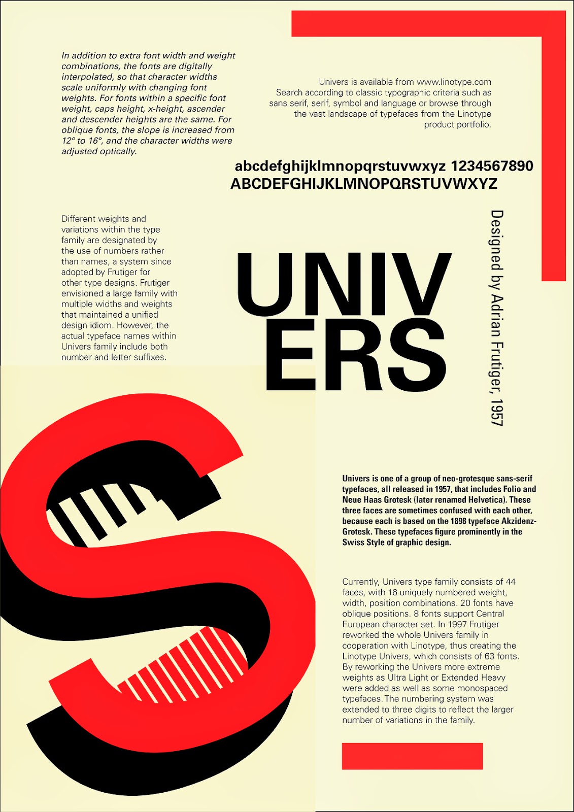
- Univers
- Gill

Saturday, 17 May 2014
Highlights of my first year at uni; Part 1. Congratulations it's a horse
During my first year I was given three moving image projects and I have never done a moving image project on a graphic design. I have studied media before but this was to prove of only minimal use as the software that I was to use was different, the hardware was new and sometimes strange.
We were give the brief of; create a title sequence for a fictional TV program from Charlie Brooker's website http://www.tvgohome.com/. We were given the sitcom "Congratulations, it's a horse". I say we as I was working with my good friend Sophie Taylor. This was the definition we of the program.
 Over the first week we came up with the idea of it being stop animation or a POV scene. However, at the end of the week, the tutors did not like it. So we took it on board and just decided the only way to achieve what they thought would work, would be to green screen it. Yes it would look tacky and have a low production value but it would get the job done. We filmed it all in one day and edited it 2 days. The illustrations are done by Sophie and work really well with my bad action on top of them.
65 was the grade that me and Sophie achieved for this piece which, safe to say I thought was a great a achievement.
Below you can see the finished film;
We were give the brief of; create a title sequence for a fictional TV program from Charlie Brooker's website http://www.tvgohome.com/. We were given the sitcom "Congratulations, it's a horse". I say we as I was working with my good friend Sophie Taylor. This was the definition we of the program.
65 was the grade that me and Sophie achieved for this piece which, safe to say I thought was a great a achievement.
Below you can see the finished film;
Thursday, 15 May 2014
First REAL Post
As far as I can tell this is gonna be my first offical post where I actually talk about me and the things that I do. So far it has just been pieces of design that bare little or no resemblance to anything that could be produced in the real world and it also varies a lot in quality. But this is a milestone.
My name is James Reay and I am a university student (art Student) studying Graphic Design. I am currently based in carlisle studying at the University of Cumbria; run by the team of Grillust (http://grillust.blogspot.co.uk/). I am just about to finish my first year and I have very much enjoyed. I have gained lot's of skills. Skills that stretch beyond Photoshop. I am now aware of Adobe Illustrator and InDesign. I have met some amazing people in my first year and hope to continue these friendships beyond the education system. I hope to post up some of the highlights of my first year work which include collaborations, personal experiment work and finished products.
My name is James Reay and I am a university student (art Student) studying Graphic Design. I am currently based in carlisle studying at the University of Cumbria; run by the team of Grillust (http://grillust.blogspot.co.uk/). I am just about to finish my first year and I have very much enjoyed. I have gained lot's of skills. Skills that stretch beyond Photoshop. I am now aware of Adobe Illustrator and InDesign. I have met some amazing people in my first year and hope to continue these friendships beyond the education system. I hope to post up some of the highlights of my first year work which include collaborations, personal experiment work and finished products.
Subscribe to:
Posts (Atom)