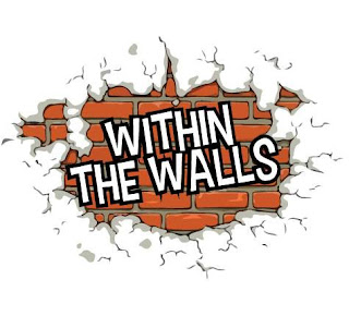
So Back to writing about my work I need to amass some work first for me to talk about it. So I have reached the threshold to talk about stuff. Now when someone asks you for a logo, the thing that makes sense is to plan it, work out what it should look like. Me really liking logo design, I gave it a good whack. I give everything a good whack.
Within the walls is a music festival within the walls of Carlisle and it needed a logo. A mark to represent it. taking a logical approach made the most sense; you don't want a deep and though proving concept logo for a music festival. Use of simple flat and bold colours have for many years worked for major corporations; Paul Rand comes to mind immediately.
I wanted this bold, flat style as it can be applied to almost anything but the client had other ideas after six attempts as this logo, that was it. They went back and hired another guy (or Gurl, I am not judging) to do it for them without telling me. So this is what they have;


No comments:
Post a Comment