Please be aware the following sequence of images may cause discomfort to those people used to browsing behance and (in the main) Pinterest.
 |
| a : "I did a graffiti" b:"whats one of them?" a : "I don't know, but I did one" |
 |
| click to zoom in at the pigeon English and blandness. |
 |
| Hobo and not for the first time. |
 |
| don't hold yer bottle up to the window children, it's not thirsty. |
 |
| who needs a logo that remains the same? lets paint each individual one uniquely. |
 |
| here we see a nice poster for a film/play/thing that references my favourite pop artist next to a font that uses Hobo, a naff colour scheme and warped text. |
 |
| legibility, we don't need that. |
 |
| Hobo and Disney font for a cafe based on elephants. Genius |
 |
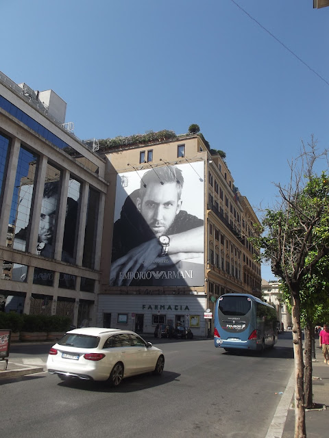
| who needs a Calvin Harris THAT big? |
 |
| if you say it in Geordie accent it sounds amazing. but it's accurately hawaii in Italian |
 |
| Leading and tracking issues, with the stacked English & Italian lines. |
 |
| Last but not least good Jazz while you eat but bad design too |

No comments:
Post a Comment